


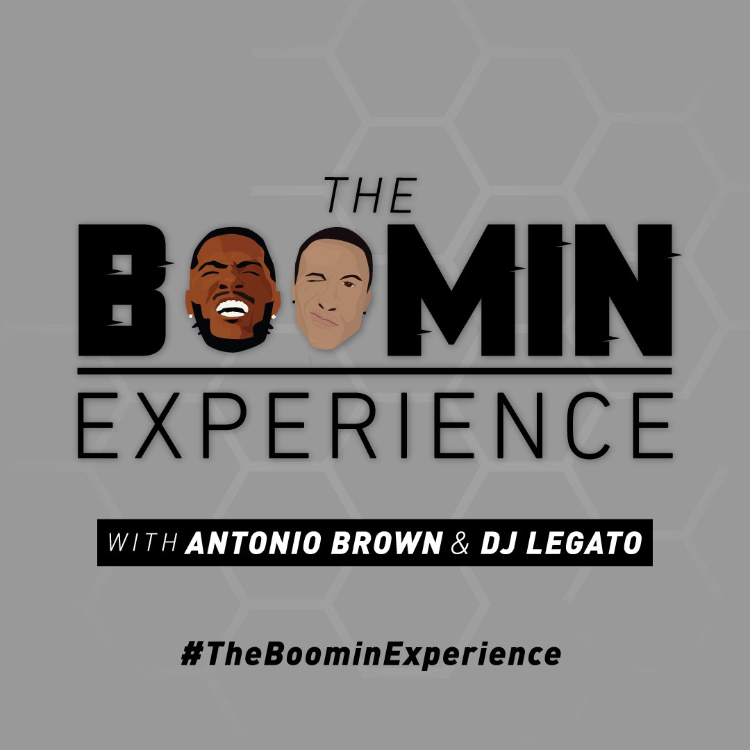
Commissioned by Antonio Brown, Wide Receiver for the Tampa Bay Buccaneers. The cover was created to gain attraction to the podcast on all streaming platforms with a fresh modern look setting it apart from other podcasts and create serious engagement and attraction. Antonio Brown and producer, DJ Legato are illustrated in a minimal WPA type style that works with just the shadows cast across there face. The 'BOOMIN' typeface is custom type that gives a quick and aggressive movement look to it.
For two years, I spent my career as an in-house Multimedia Designer & Creative Lead for Vantage West Credit Union.
As a part of my position, I created a multitude of different marketing materials including murals, print materials, and basic motion graphics. I was responsible for the Creative and Marketing Strategy as the Premier Lead Sponsor of Dusk Music Festival and the creative direction of the Super Saver Program, a child savings program redesign.
A part of the Creative and Marketing Strategy was social media to which I built and led a campaign highlighting the stories of Vantage West Employees and Members. It recieved two awards including "Social Media" and "Complete Campaign" and the Credit Union National Association Diamond Awards.
The visuals here are only a select few examples of the work I produced and directed in my time including recent mural installations (designed and commisoned by me in Vantage West's corporate building and North Stapley Branch), advertising motion graphics and marketing materials.
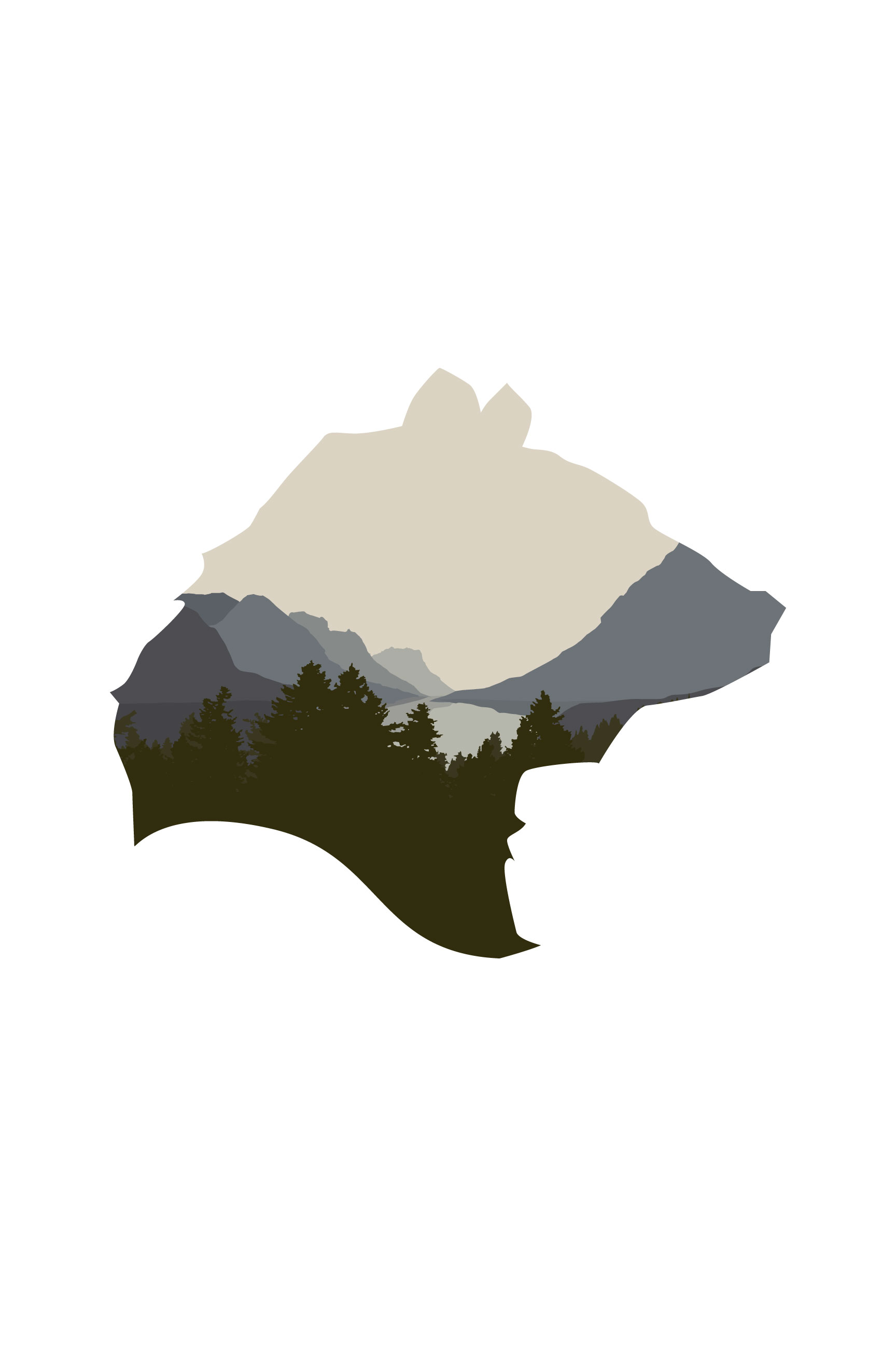
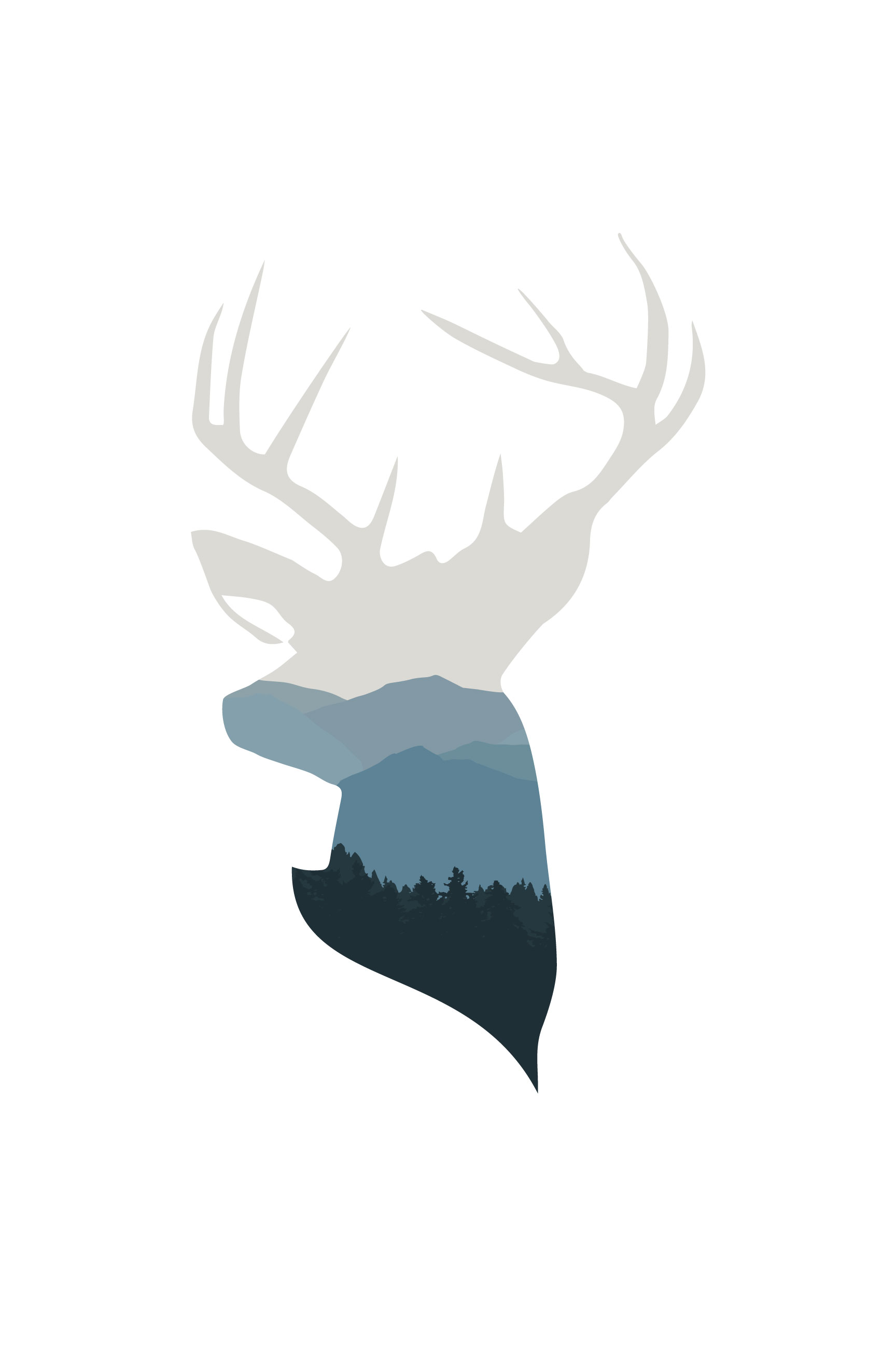
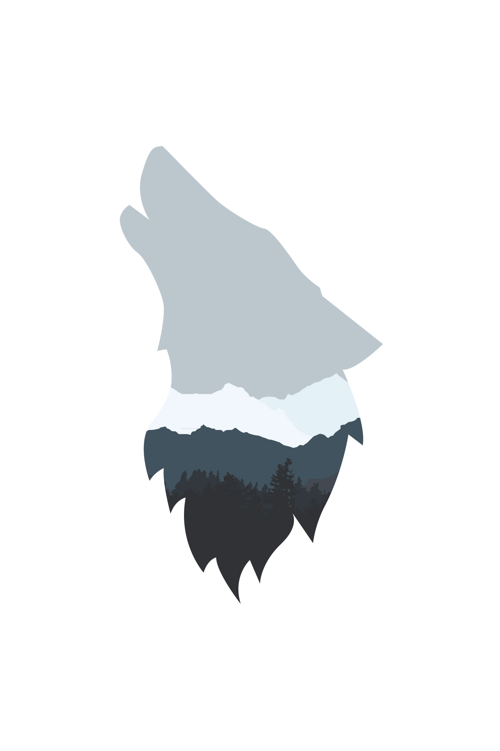
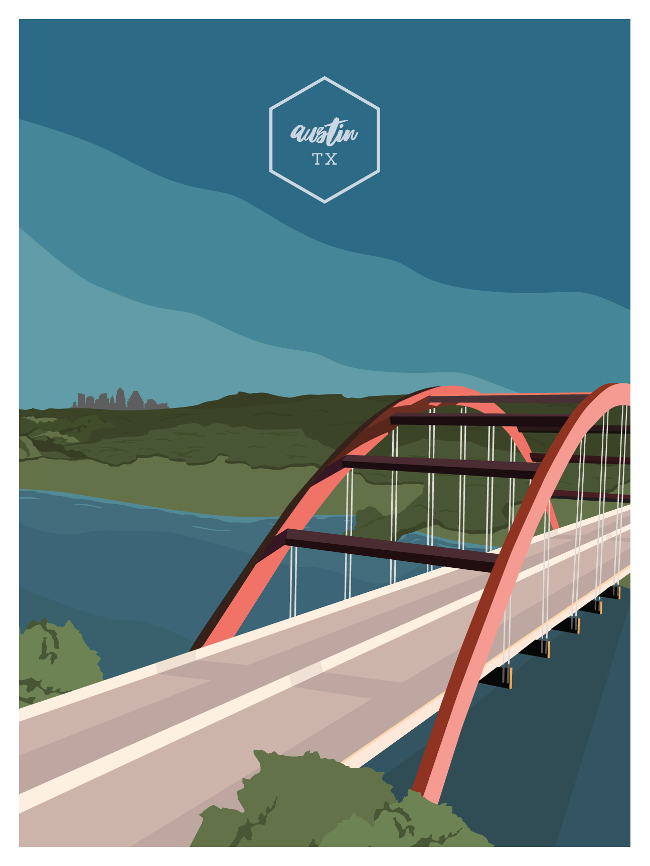
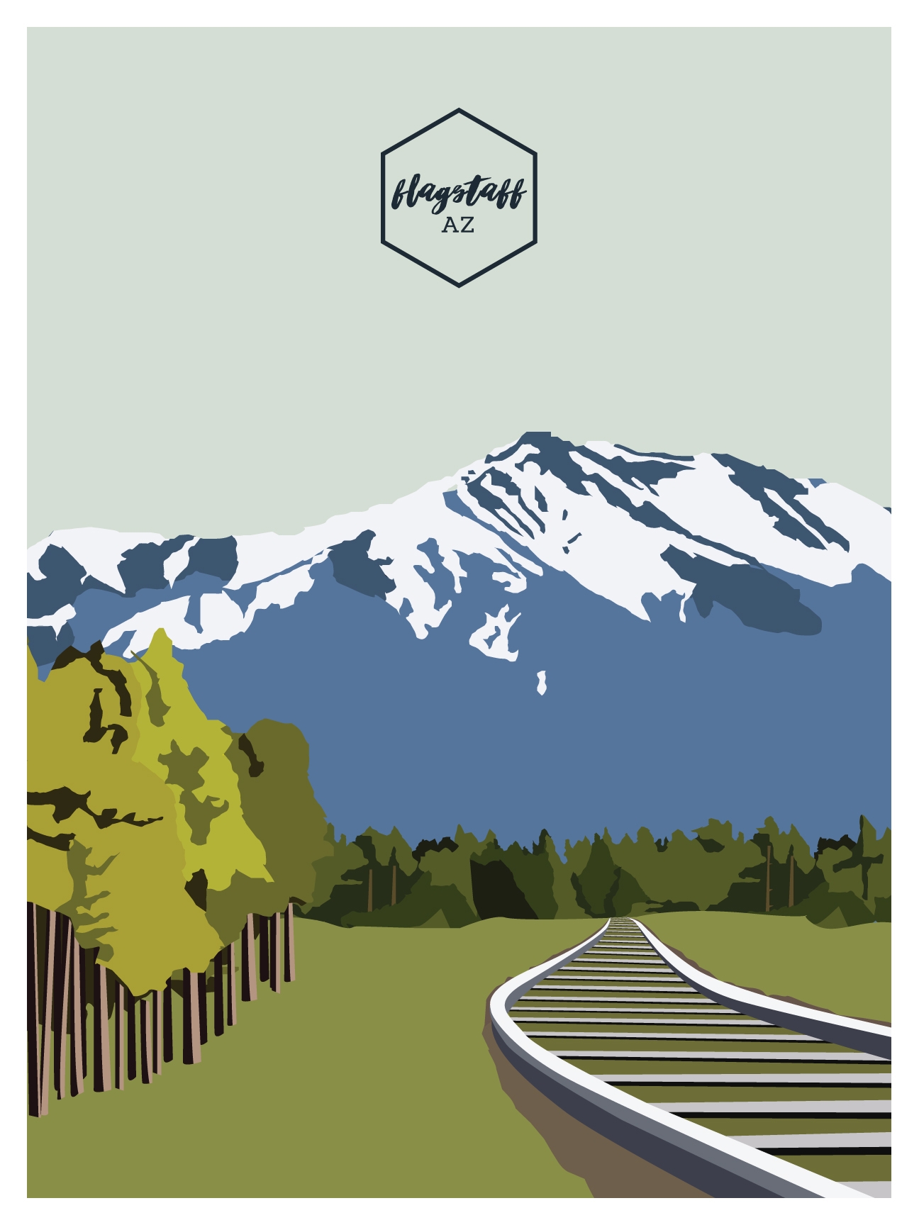
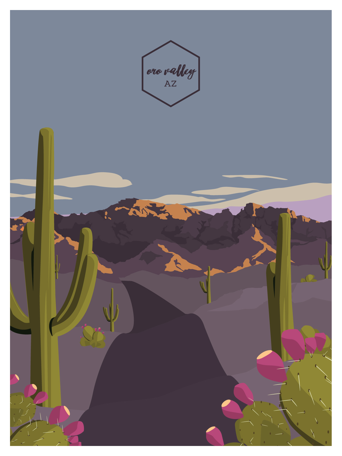
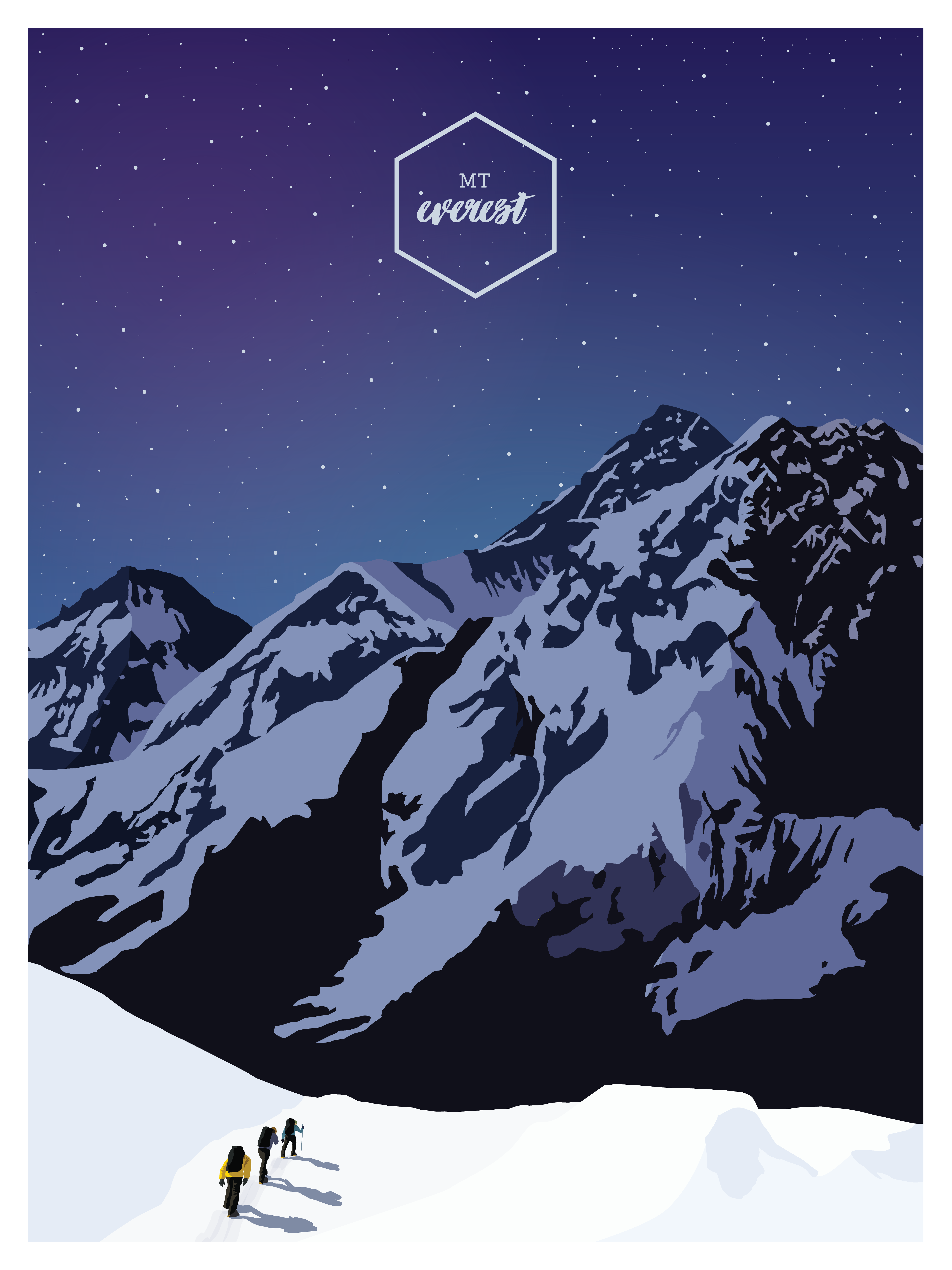
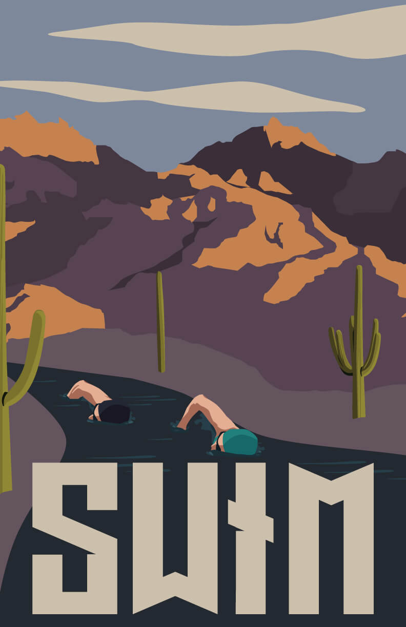
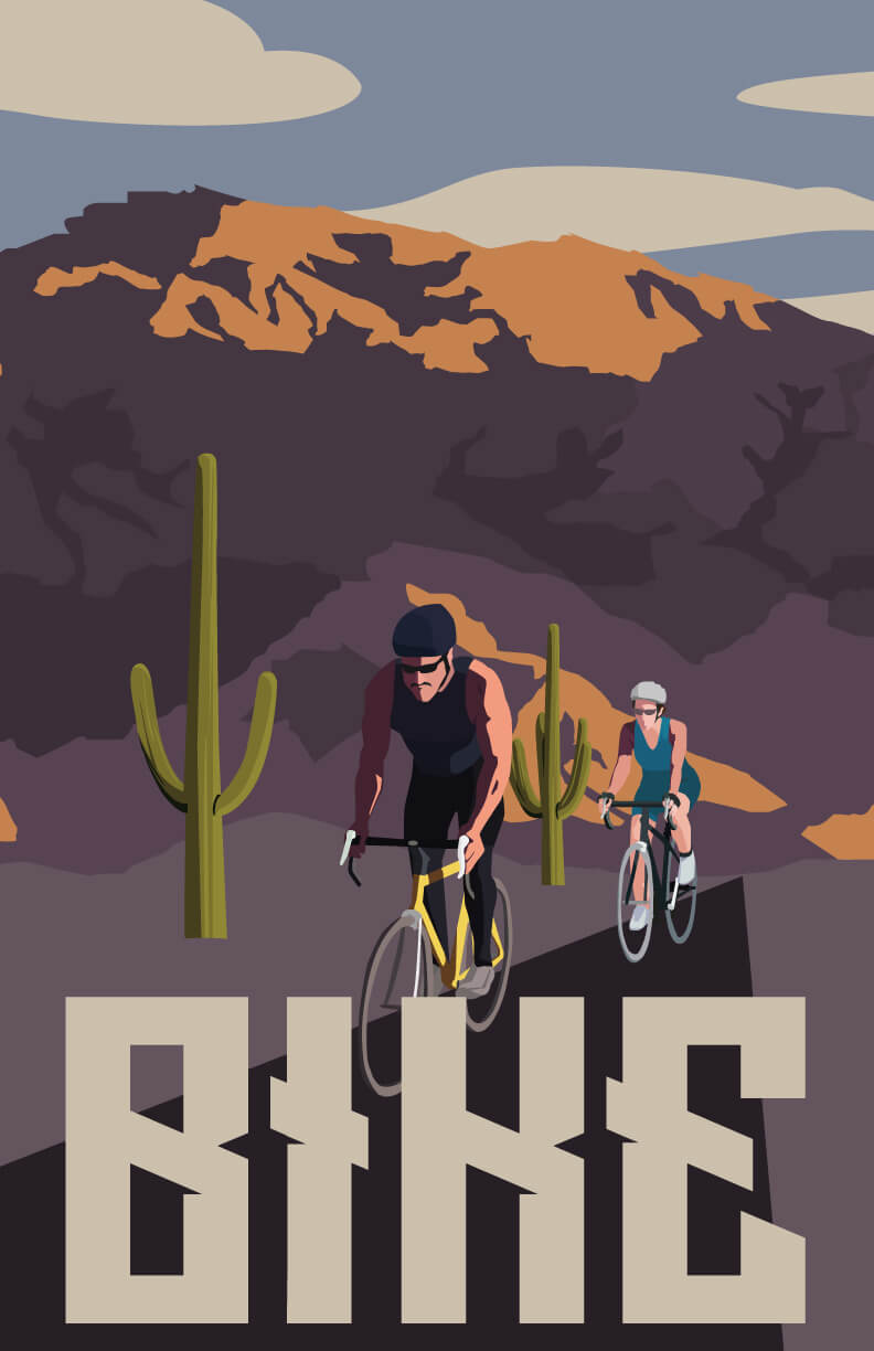
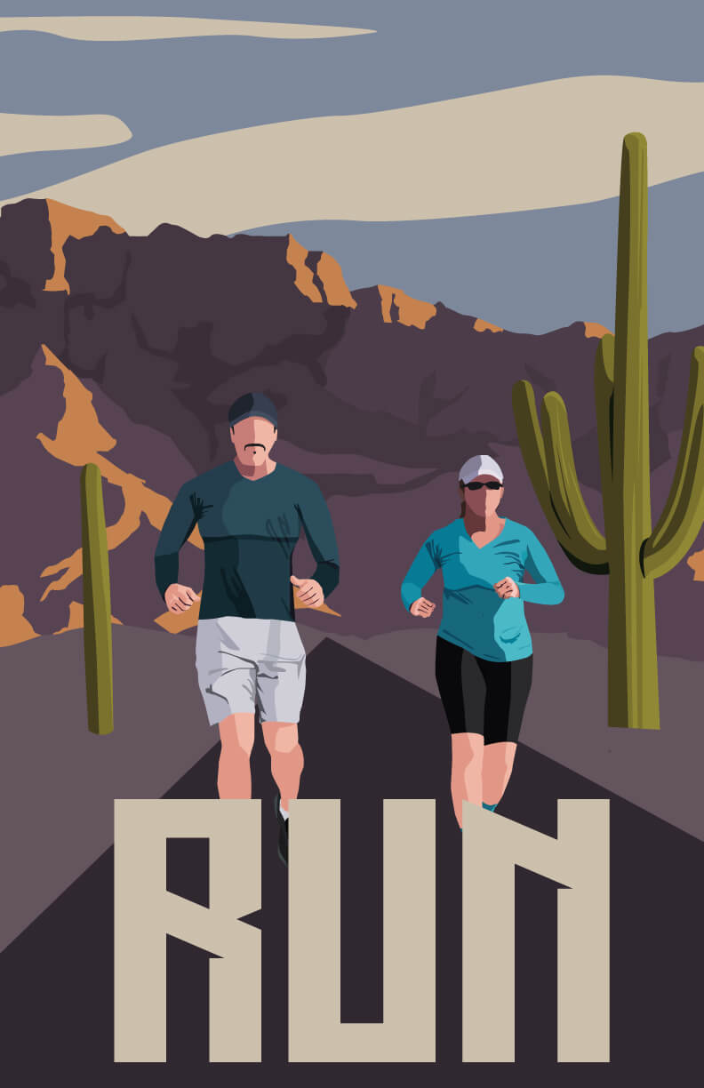
Sudden inspiration sparked me to create these WPA style prints for my own enjoyment and peace. Once seen from others, I launched to my store and they are without a doubt my top seller.
Separated into multiple series of magestic wildlife, cities that I've called home and inspring landscapes, I created illustrated outlines and customized to my liking. I selected complementary natural color pallettes and fonts where appropriate. I hope in the future to launch these within a department store and am currently looking for a sponsor to do so.
The past two years of my career, I have been with Pima Community College as an In-house Senior Web Designer.
I started by helping create a templating system for PimaOnline courses to allow instructors to select a variety of online course web designs to best fit their content. I was responsible for the overall design including front-end development. I then moved to Pima's web team doing large improvements to the Pima website.
I have since fully designed and developed a Web Brand Guide, a Time Management Calculator, and many design improvements, icons and design guidance.
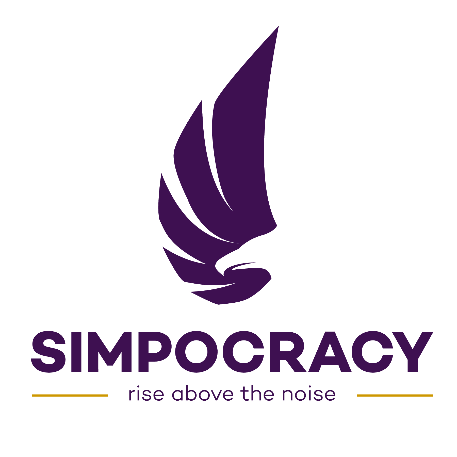
Originally starting from a podcast, Simpocracy's goal was looking to grow into a serious company to help create an easier way to understand the political world, educate americans about world and national politics and providing a bias-free news source. The project given was to build the company's brand identity including a logo creation to reflect the company's modern & simplistic intentions and direction.
With their brand identity, they're goals were to seem sleek, confident and simplistic. Additionally, Simpocracy requested to continue the use a phoenix form the podcast cover as their mascot/brand to show that they 'rise above the noise' of bias in media and throughout the political world just as a phoenix rises from the ashes. This final mark uses negative space to create the phoenix and matches the slogan with the motion of the wing creating the viewer to rise up with it.
A color palette was created to accompany the mark. The use of purple, was a mix between republican red and democratic blue to continue the "unbias view" and we accompanied it with other bold colors, such as the gold, to represent strength.
The brand's typeface, Campton matches the overall simplicity of the company. It is a strong and clean san-serif that ties the brand together and gives a confidence to the company.
To accompany the brand identity, A set of icons and an 'un-bias' verification logo was also created to use on different stories that are primarily politically central.


My time as an in-house designer at American Campus Communities was met with many exciting projects.
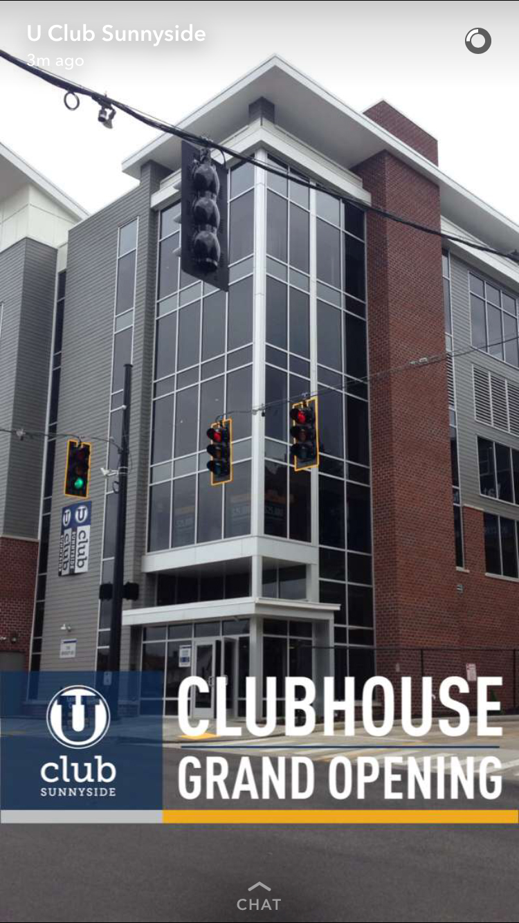
When Snapchat introduced filters for the public, I immediately jumped on the idea. ACC was falling short in their social media presence and knowing the usage of snapchat in the college environment, I knew that the next step for us was to create filters for students to use at events and around the communities.
Part of the ACC brand is consistency through all of our markets and finding a way to brand our communities together within a market. With that in mind, I created a few templates for communities to use in single are joint market settings. I also created these filters with consistency between them in mind but also giving a little bit of creative freedom to call out different events or call outs.Our filters virtually cost us next to nothing and saw millions of views.
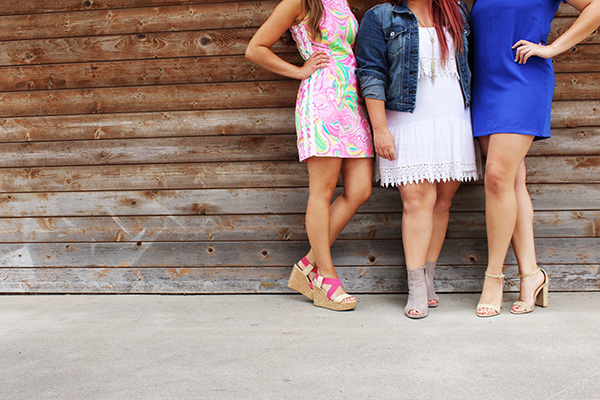
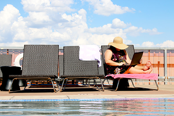
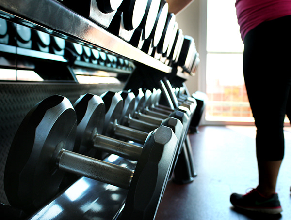
Below is a short sample of some of the photography I have taken for American Campus Communities. American Campus' internal social media catalogue is available for 200+ communities to use the photos on their Social Media pages to advertise for events, post about holidays, and much more.
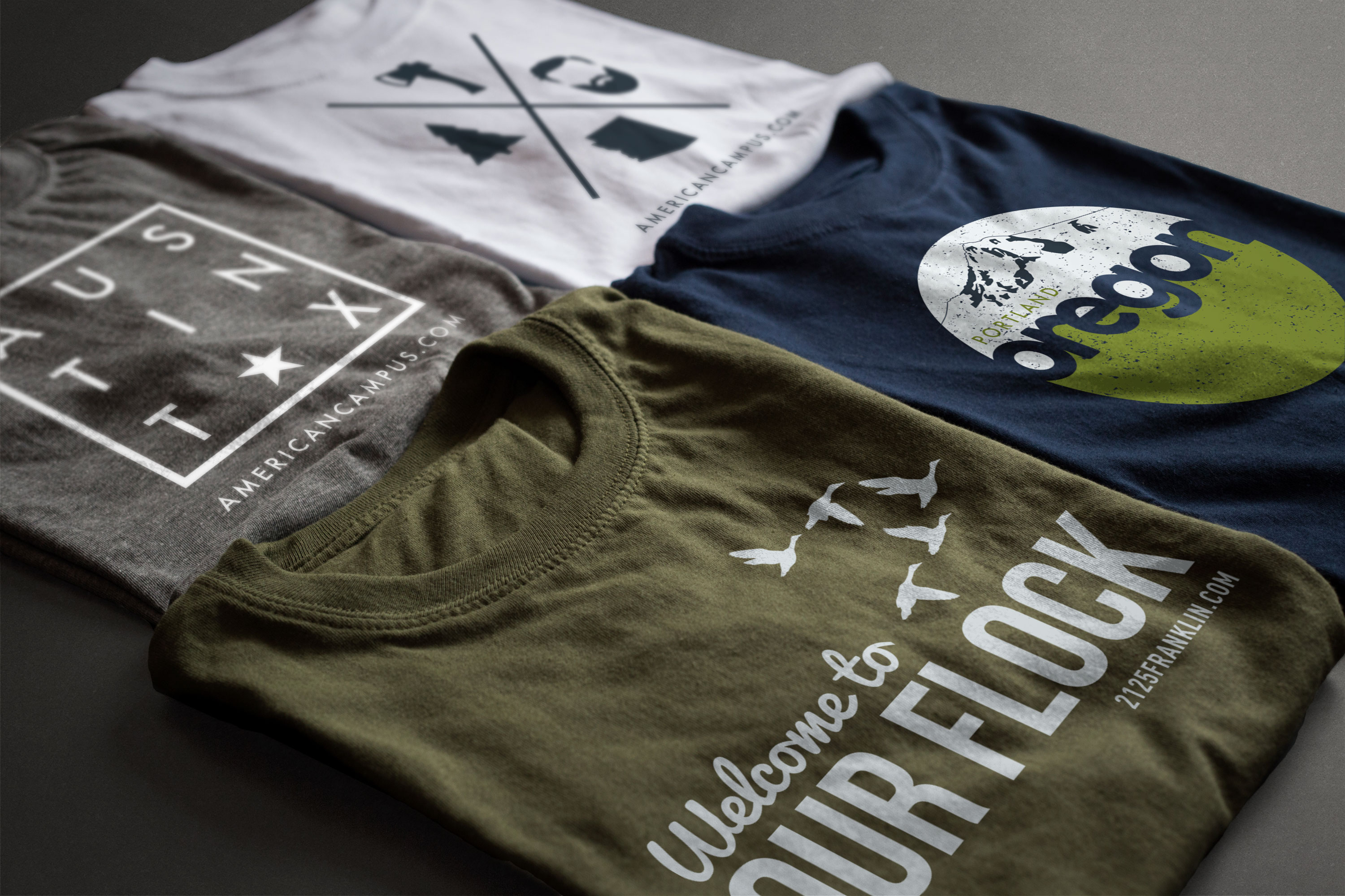
One of my favorite things is custom T-shirt designs. We would make shirts for our communities that are somehow involved with the school, location or community but also make them exciting and enticing for students to pick up and wear around campus. Here are a few examples of some design I have recently created.


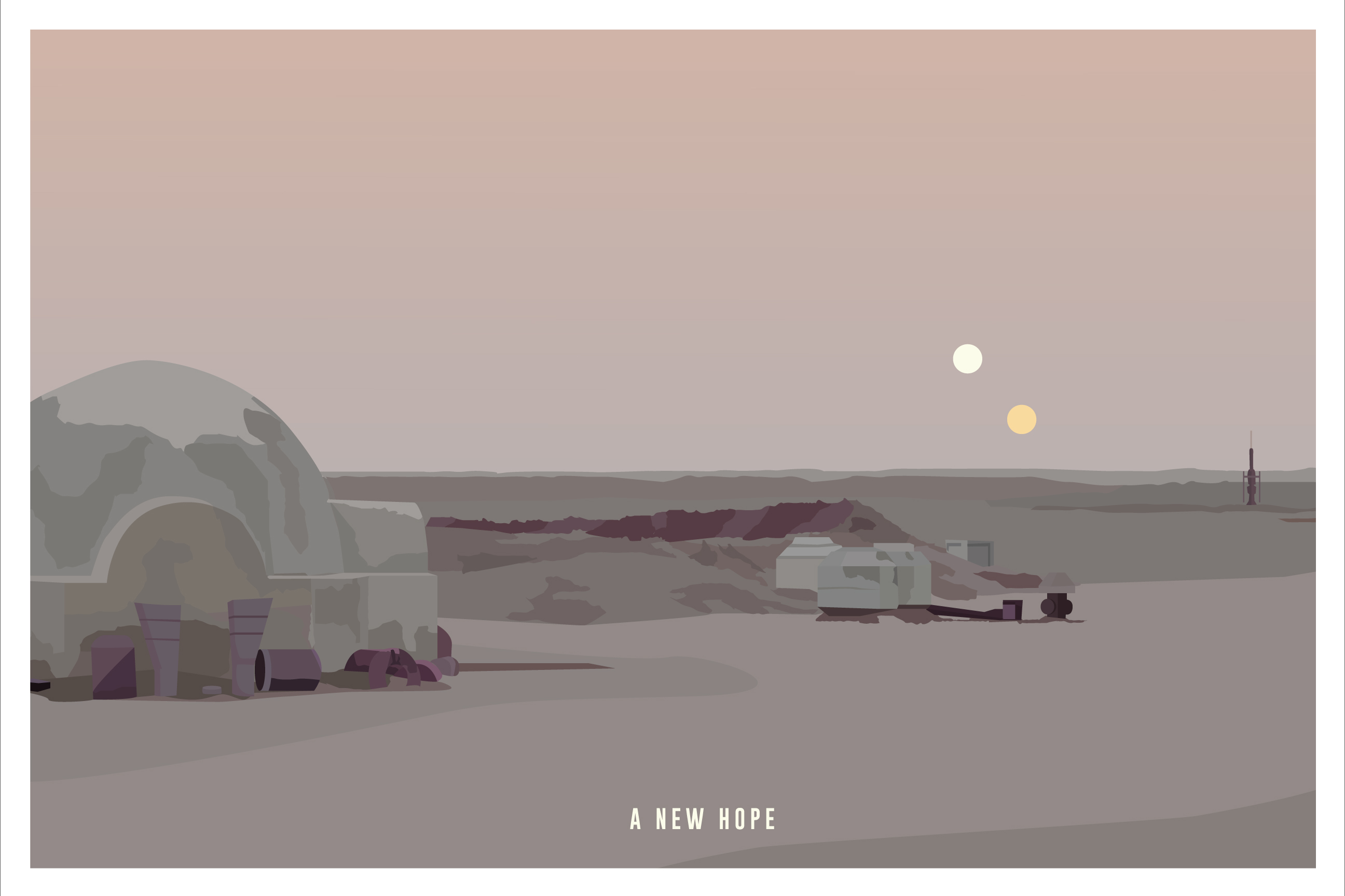
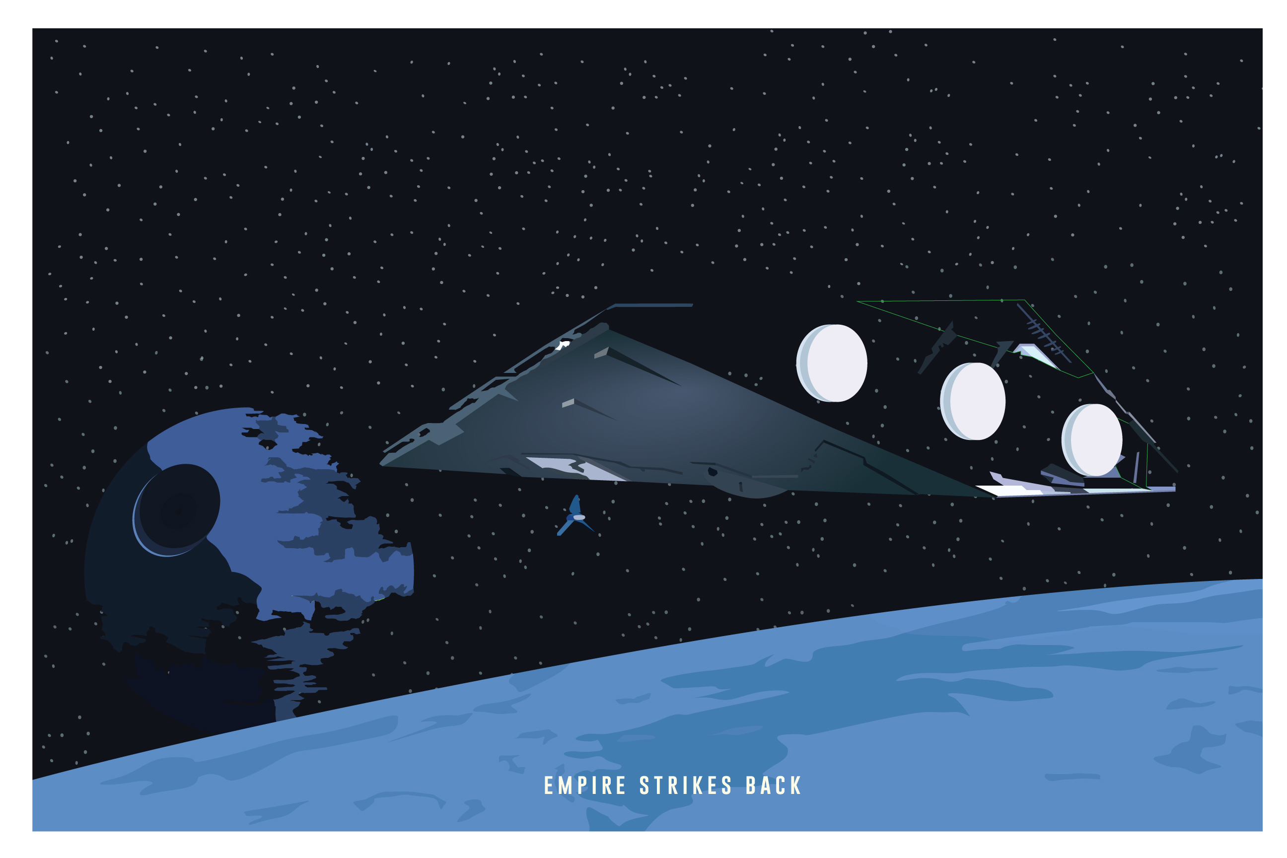
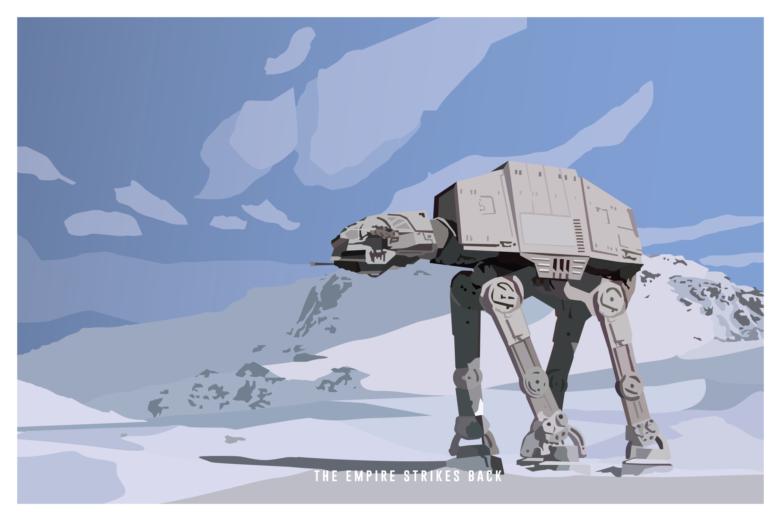
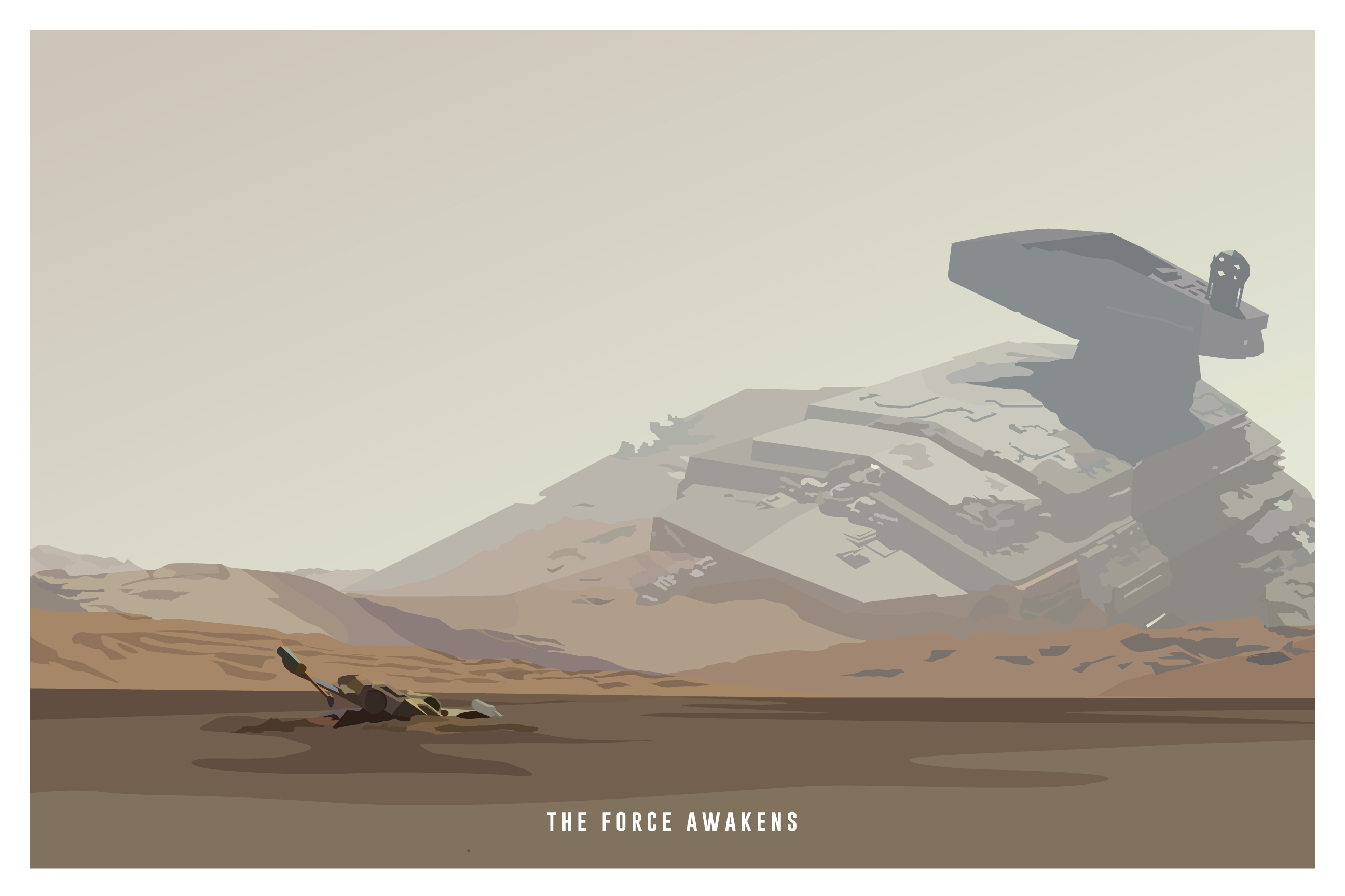
My love for "the wars in the stars" inspired me to create some fun WPA style landscapes of my favorite movies (1, 2 & 3 don't count - everyone knows that).
In each print, I tried to find a scene of the movie that really resonated with the overall storyline of the film. Much like my other WPA style prints, I only highlighted important features of each scene.
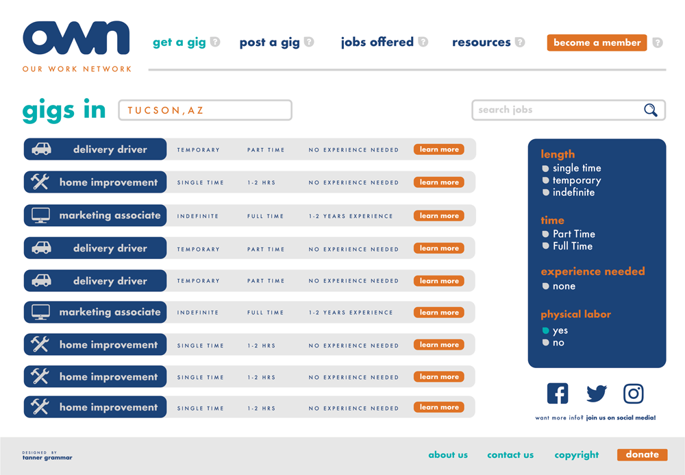
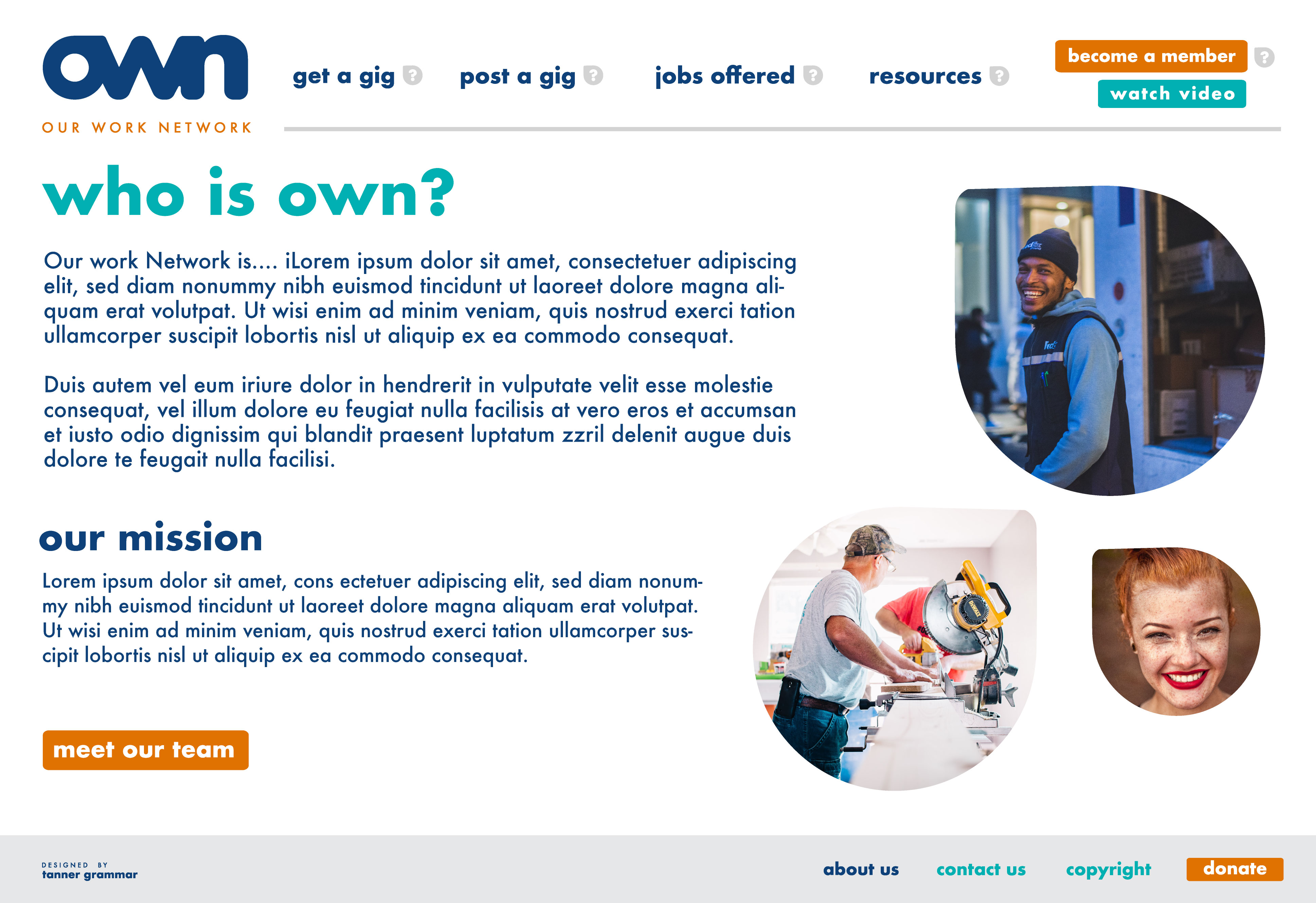
Among the many stresses of the pandemic, we saw millions lose their jobs. With that many were on the look out for new work quickly. Our Work Network, OWN, is a local start up attempting to find an opportunity to assist those looking for temporary or permanent "gigs" and vice versa. I was contracted out to help their team come up with a brand identity and web presence that would be sent to developers. Below is a few snapshots of the Web and Brand Identity. *OWN has since been on a hiatus.*



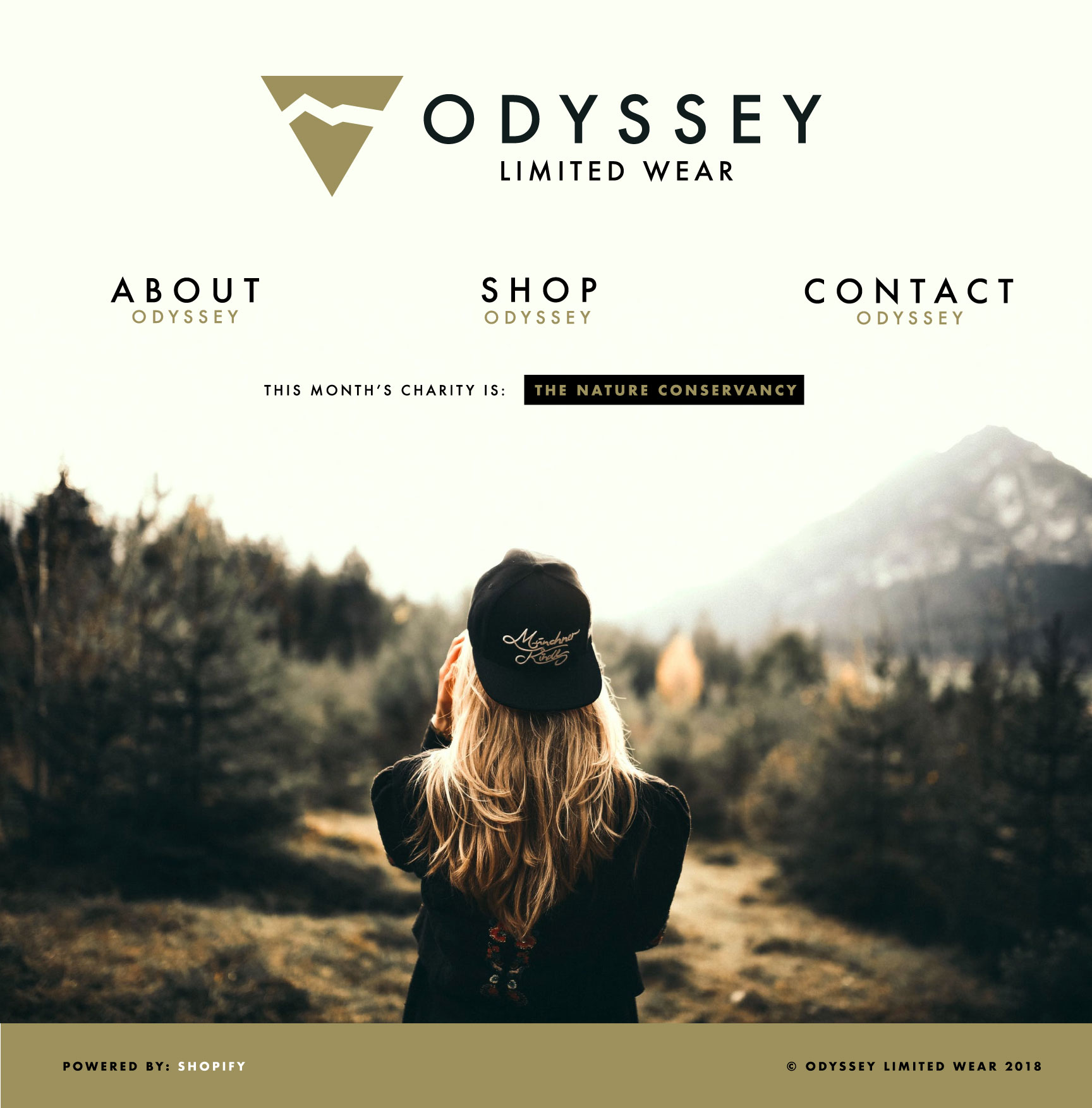
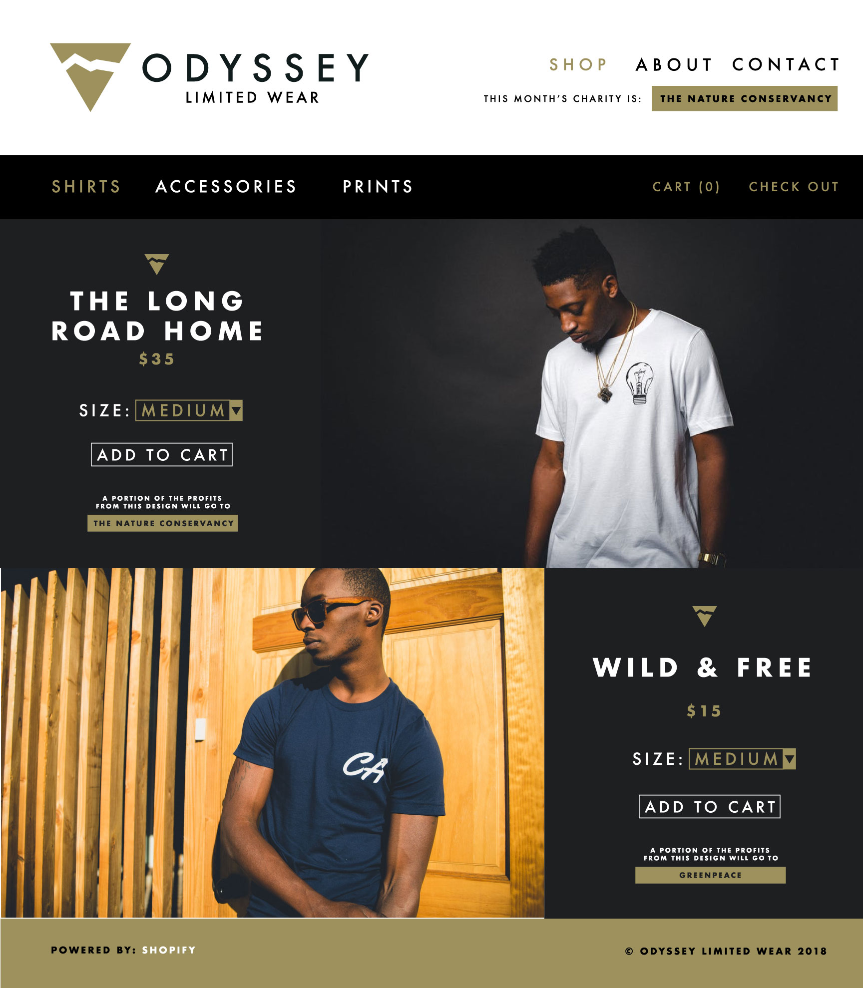
Odyssey Limited is a personal project I have been developing, looking to go live at the end of 2022. An apparel and community project, the goal is to give comfortable and trendy apparel to the public while giving back to areas that need most. Every item of apparel will have a portion of its proceeds donated to natural and wildlife charities.
Below is a sneak peak portion of the Website Design and brand style to come
I was approached by the owner of this dance studio to help them come up with a distinguishable mark for their new up and coming small business. I wanted to provide something that was modern and clean and something that stood out from other dance studios. Most studios you see use a dancer in their logo but i felt that was too spot on and wanted something that expressed dance and movement. The flow of the numbers and the connection of the 2 to the 0 was inspired by just that.
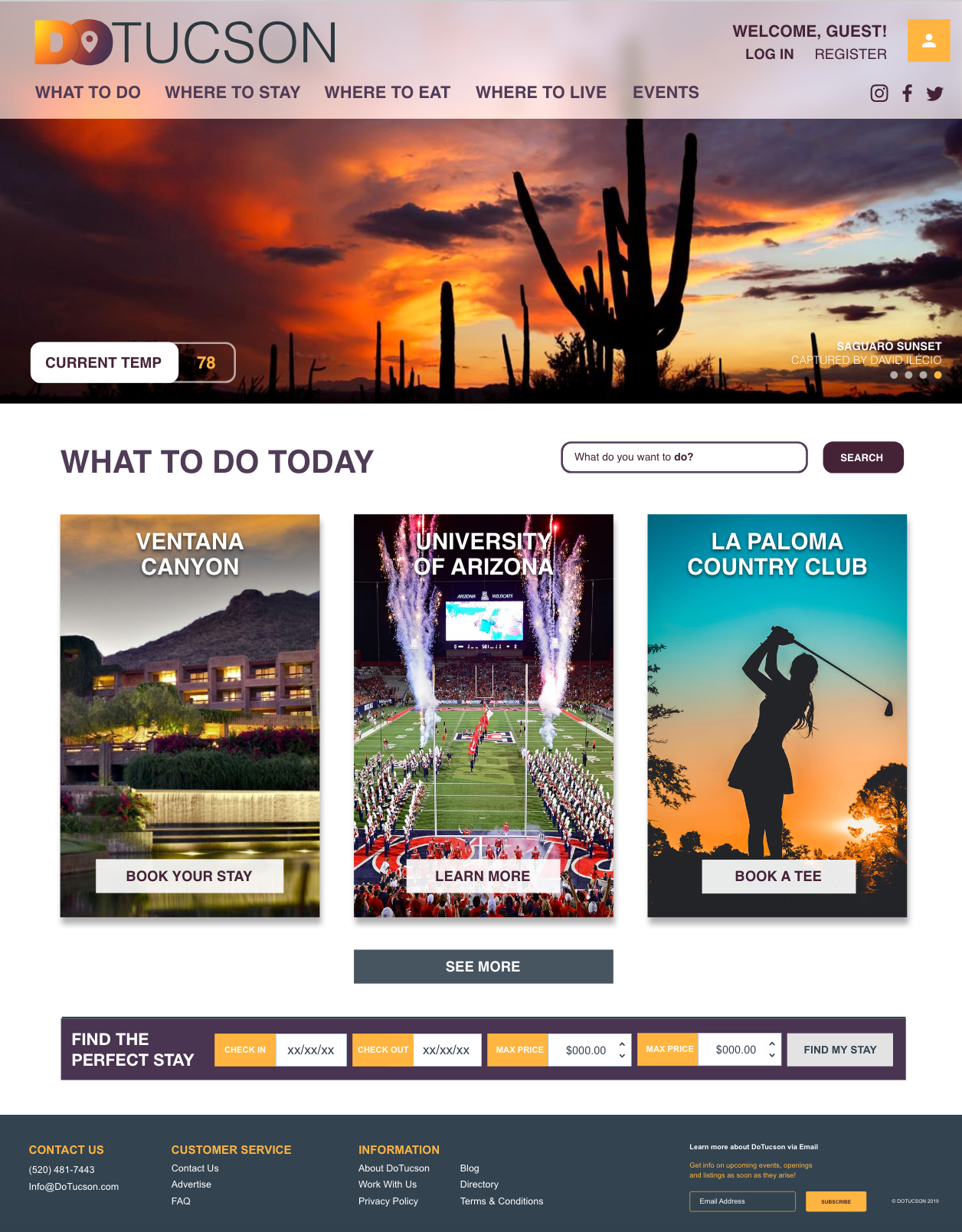
DoTucson is a web location to satisfy all your curiosities about what is going on in the city, local restaurants, hotels, and events as well as where to permanently stay if you are looking for a permanent stay.
I was approached by the client to develop their overall brand identity and UX/UI design to hand over to a developer. After design of this mark and site, I was brought on to help as a freelance creative strategist and director as a larger design paradigm assisting with the design and development direction from an external design firm.
That project is currently under development but this is from the presented below is from the original scope of work before i was approached at a bigger role.
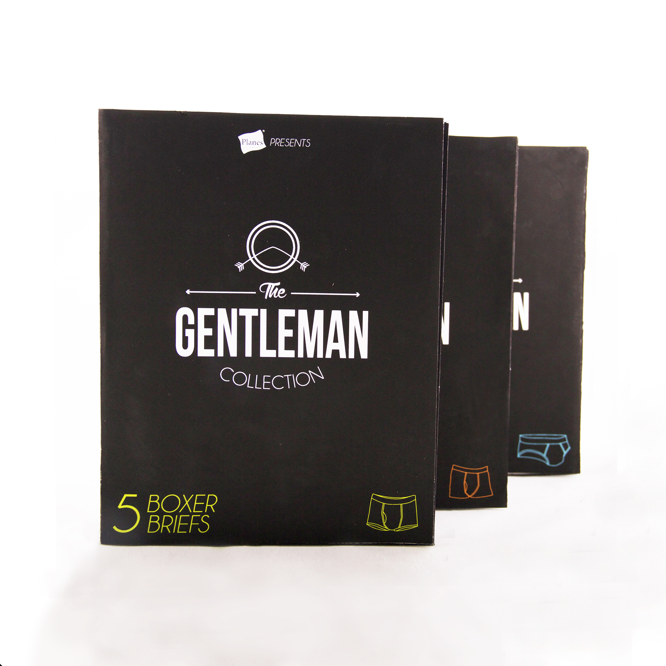
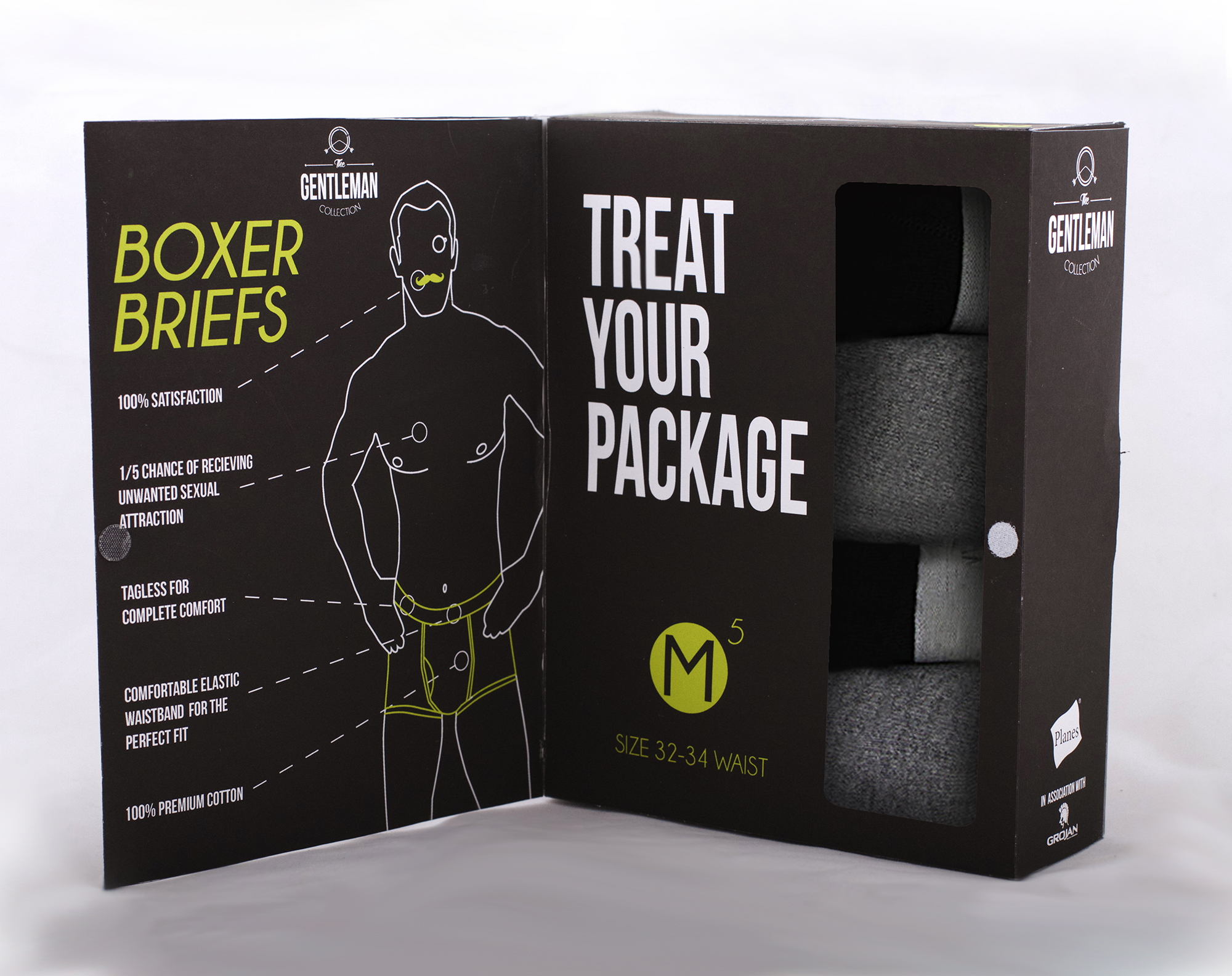
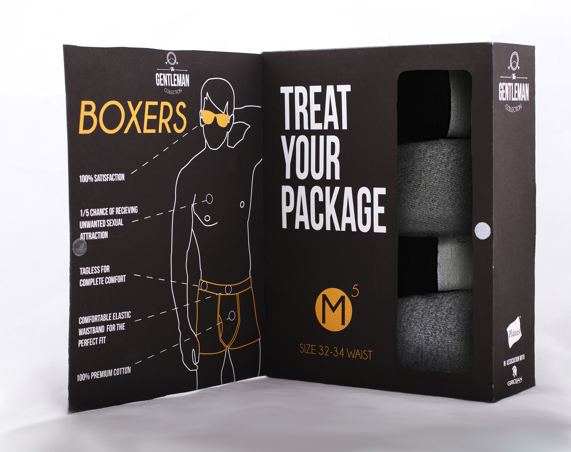
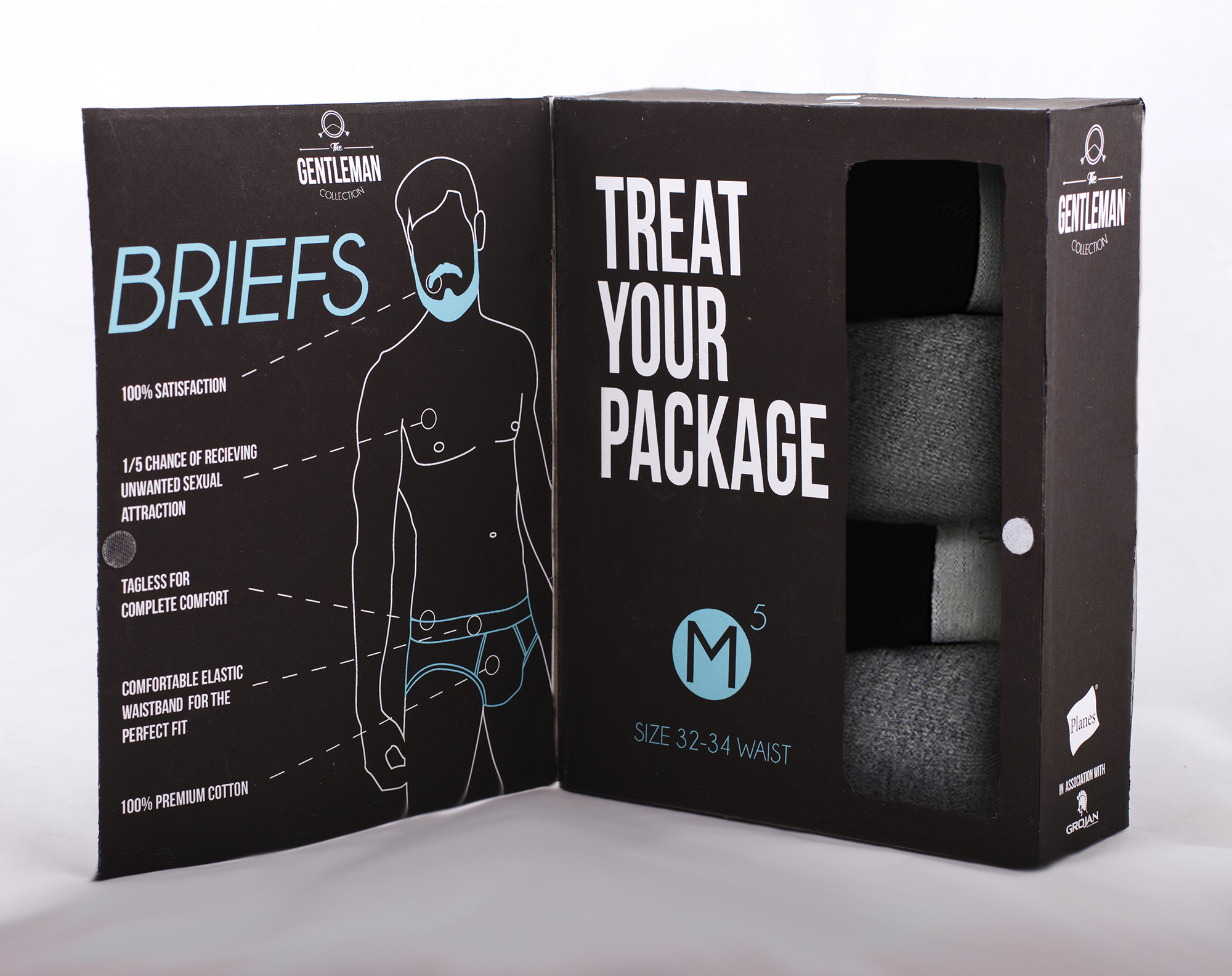
This Package is a mock up for a possible new underwear branding idea. The overall idea is to take the embarrassment out of buying underwear by creating a bold and discrete packaging, yet still building confidence in buying the underwear creating assurance in the customer that this is the right product to buy. This was a school project with the direction to redesign a product you can find in stores.
The overall design of the product was simple. I wanted to create a package that wasn't like the basic packaging for mens underwear but not to crazy to take away from the functionality. I decided the best way to do this was make a nice stiff packaging unlike most underwear packaging and insert a external cover flap that would easily give the "discreteness" wanted and also allow for more space to give information. I also decided to go with a very clean bold design that didn't distract the customer from the purpose of the product and also give them a feel that they were buying a higher quality product.
The idea started small. My main goal was to make buying underwear less embarrassing so I new the easy way to do that was to hide the underwear and also get rid of the male models on the front. I also found that guys don’t want to buy underwear that is colorful, usually. So taking away a lot of the color would be the next step.
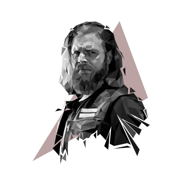
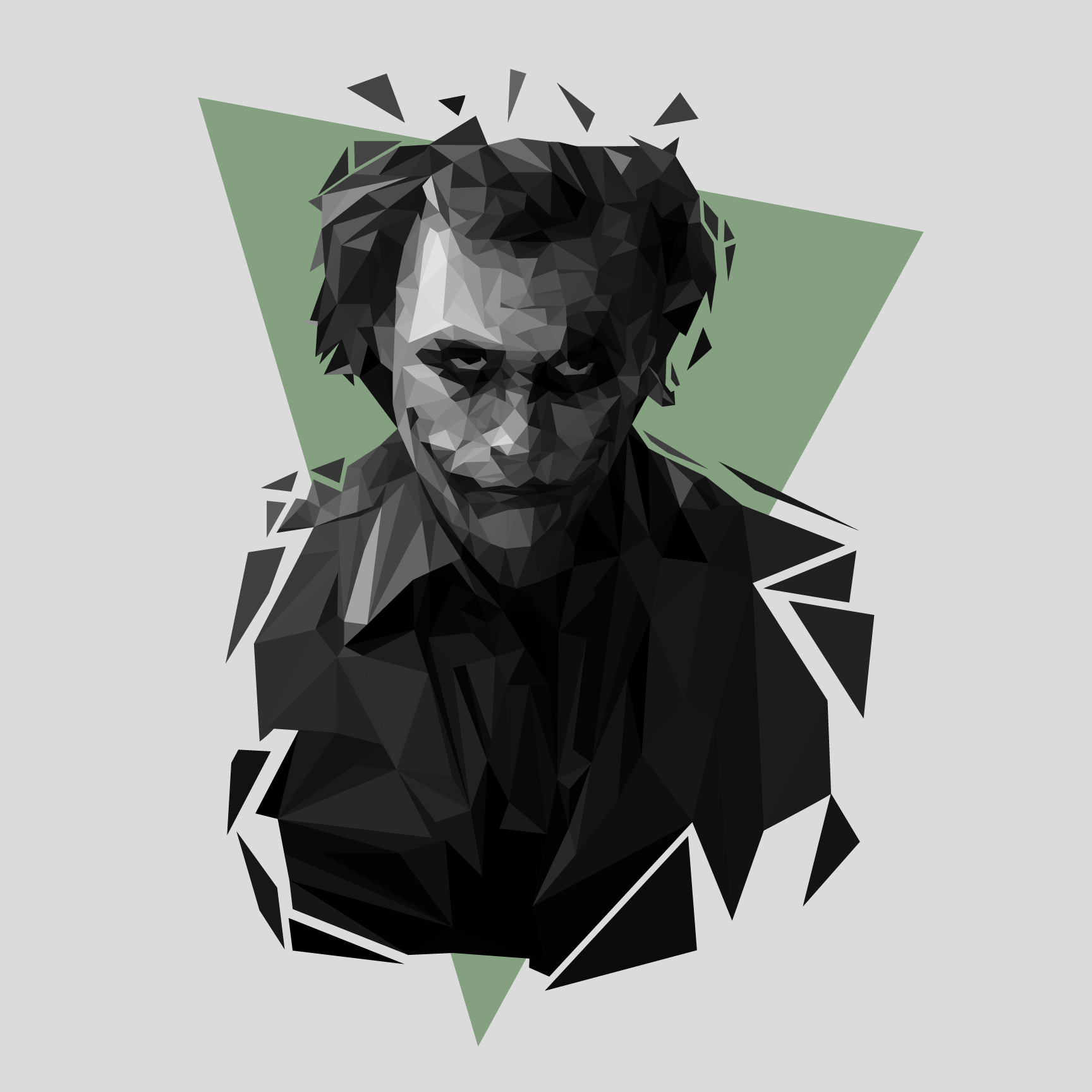
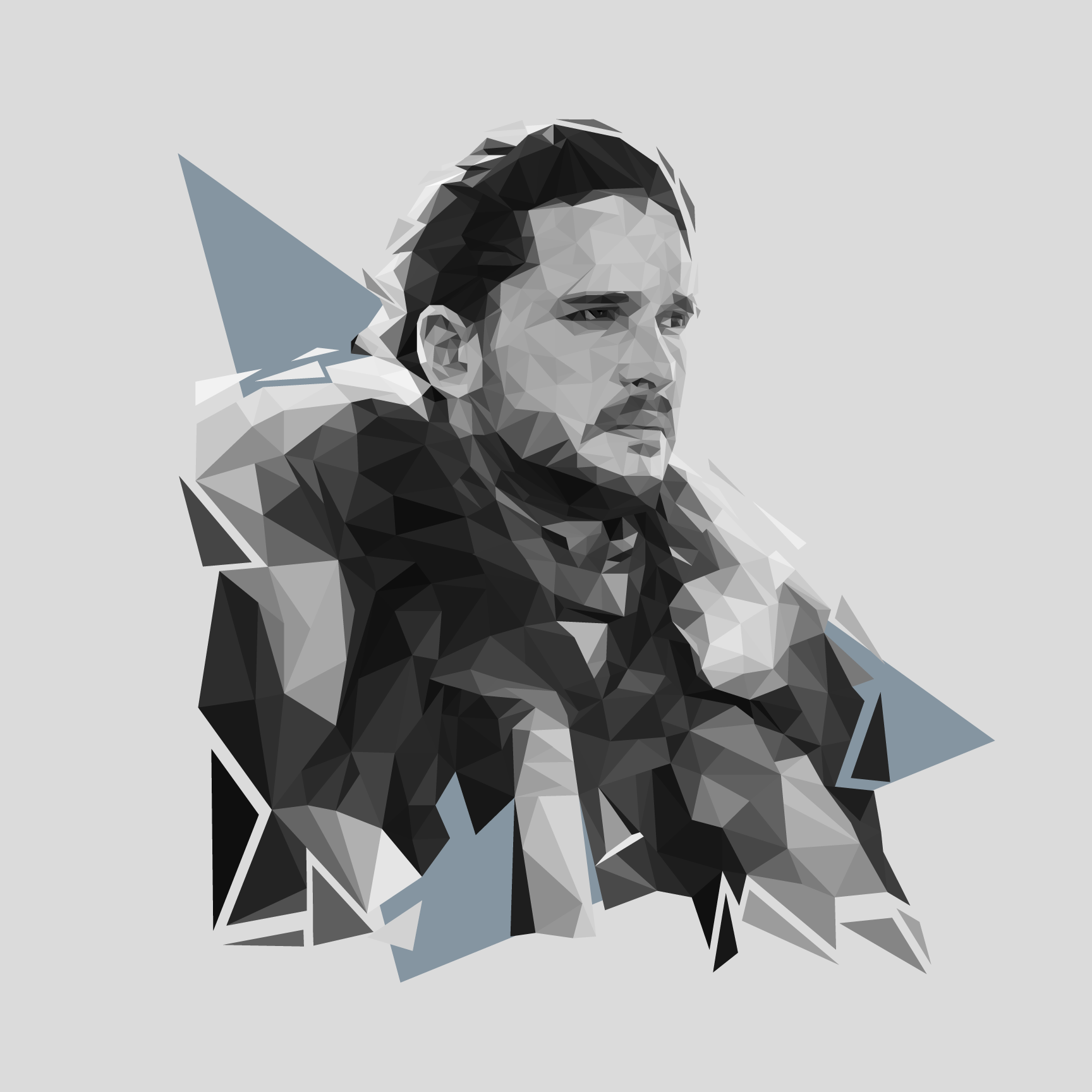
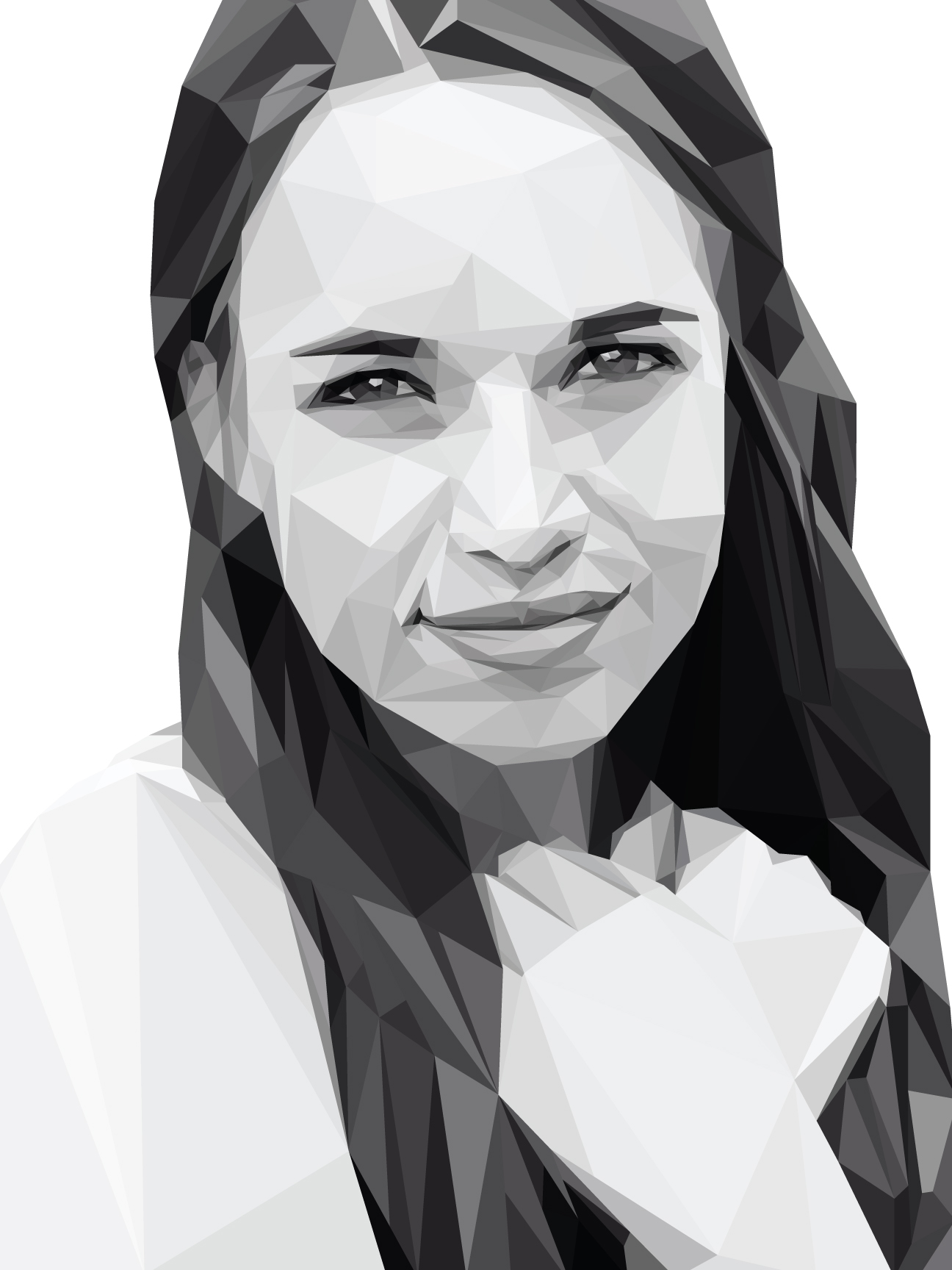
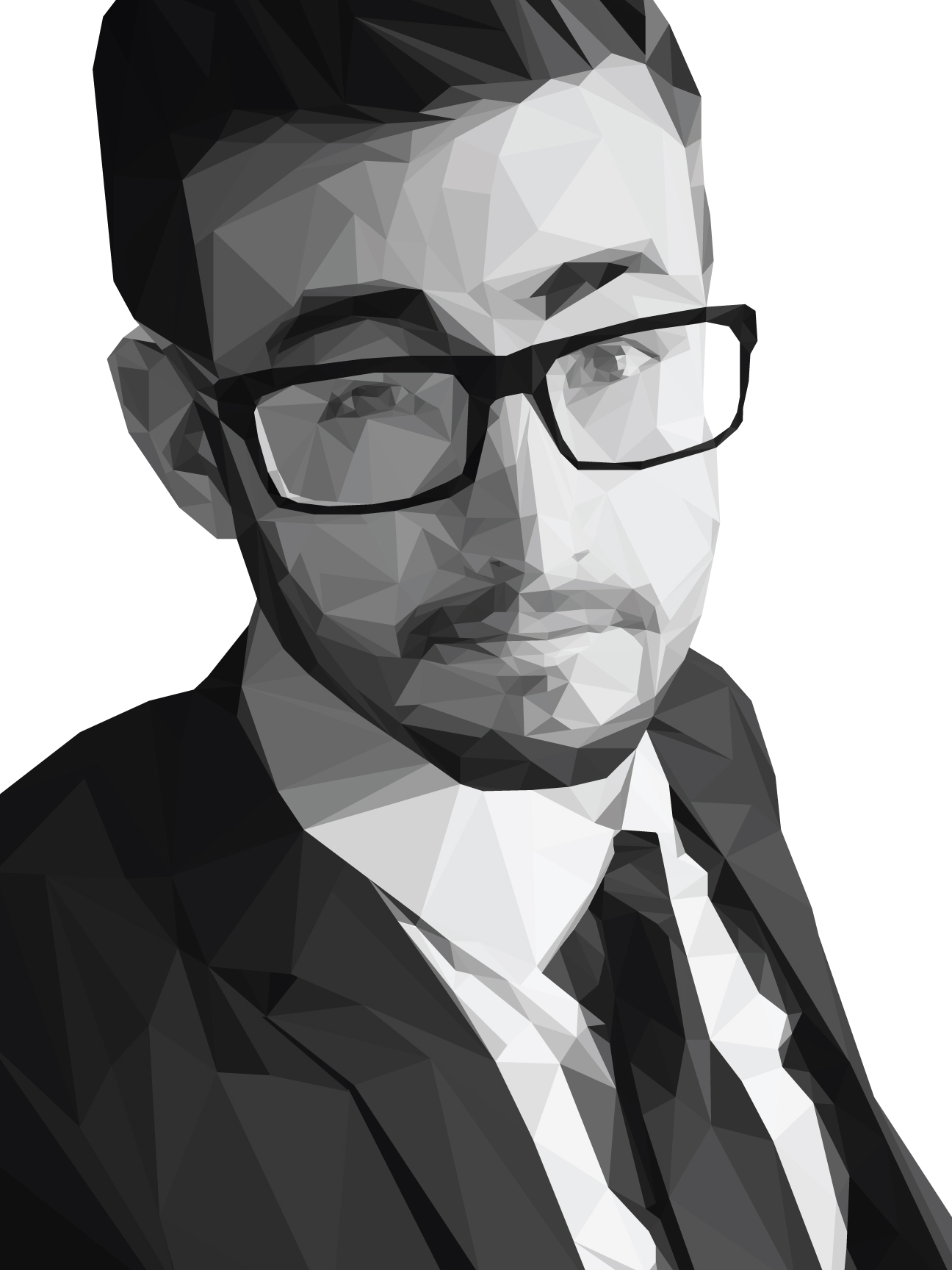
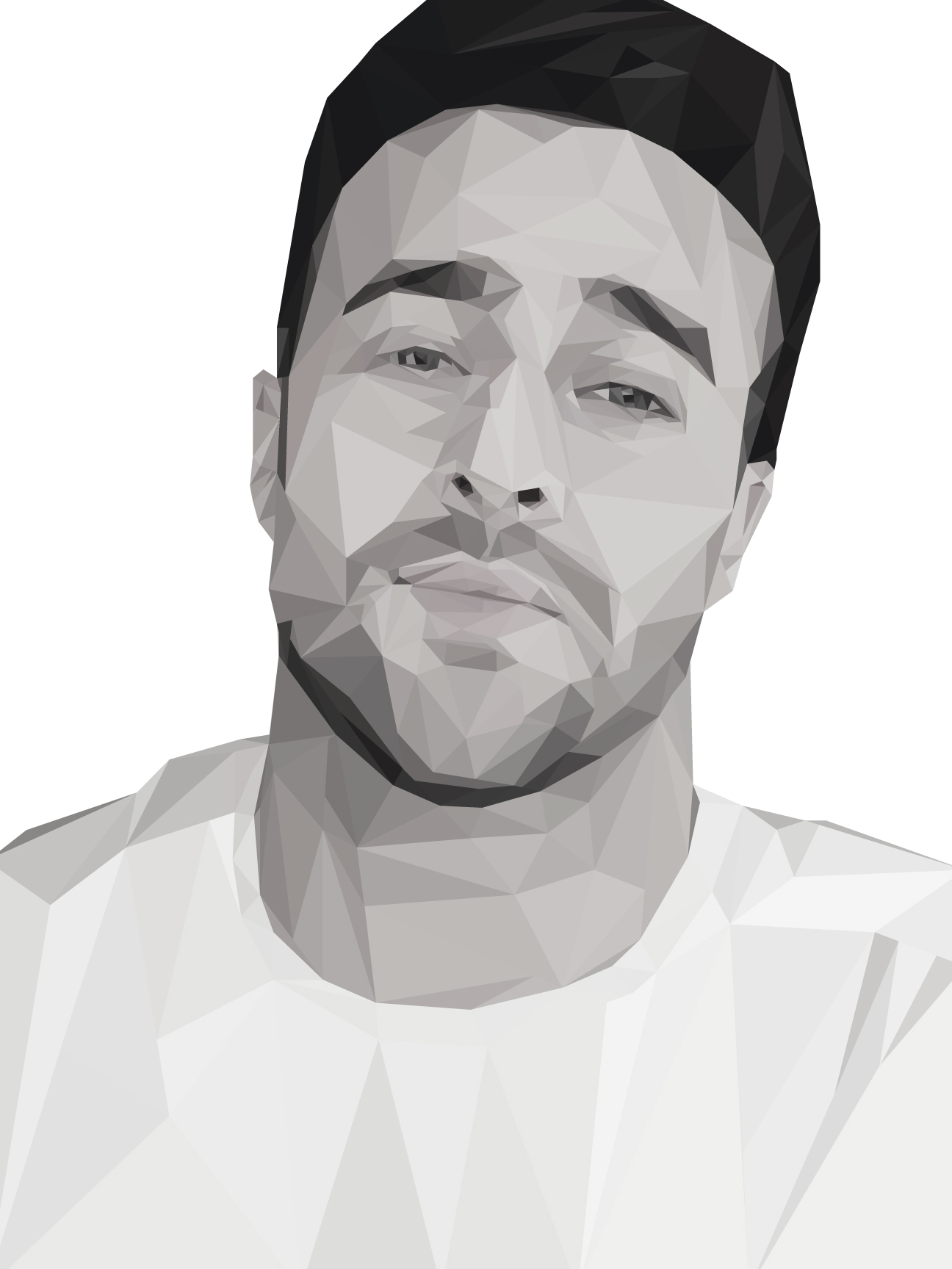
A passion of mine has been Low Poly Images and I have been contracted on multiple occasions to create some Profiles in the low poly style. Below is a few versions of these commisions.
I go very minimal with the background and and it plays really well with the over all low poly look. The grayscale was something I really enjoyed working on and I believe added more to the low ploy effect of each piece. The single color triangle on each defines each character and adds feeling and moods to each piece. I also decided to take the low poly a step further and add "breaking" into each piece but I was very strategic on placement and how I wanted it to look. For instance Health Ledger's Joker had a lot of sporadic pieces flying out from his head. Its subtle but adds a lot more to each character and piece.
Commissioned for a food marketing company called FoodMix as a part of a marketing campaign. Similar to the above, they enjoyed the broken look but wanted all color portraits
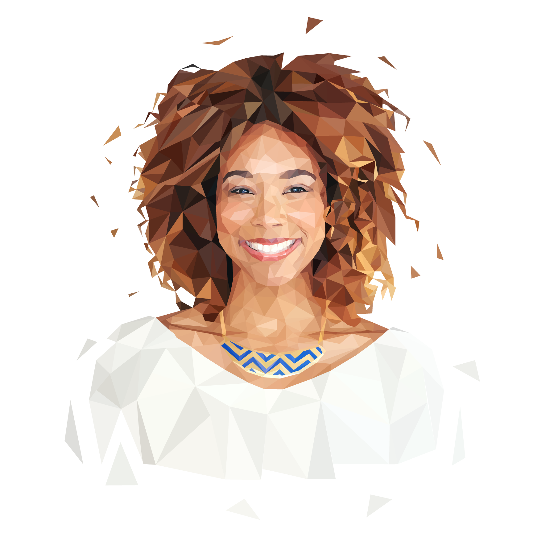

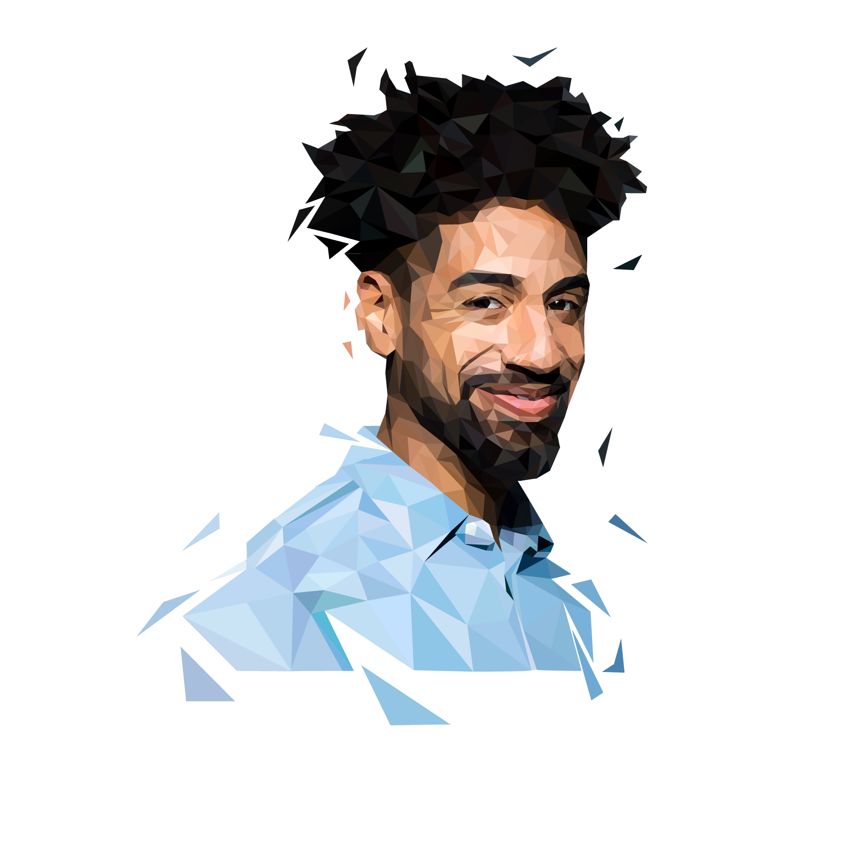

This final series is a sample of where i started, without the fractured look for a personal project.
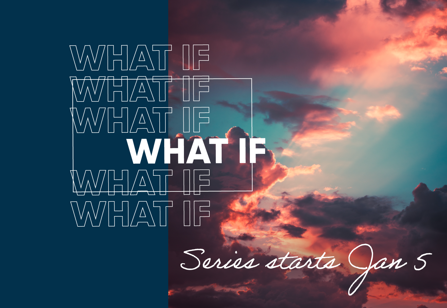
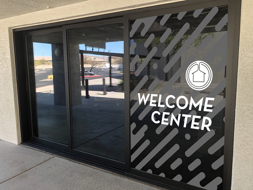
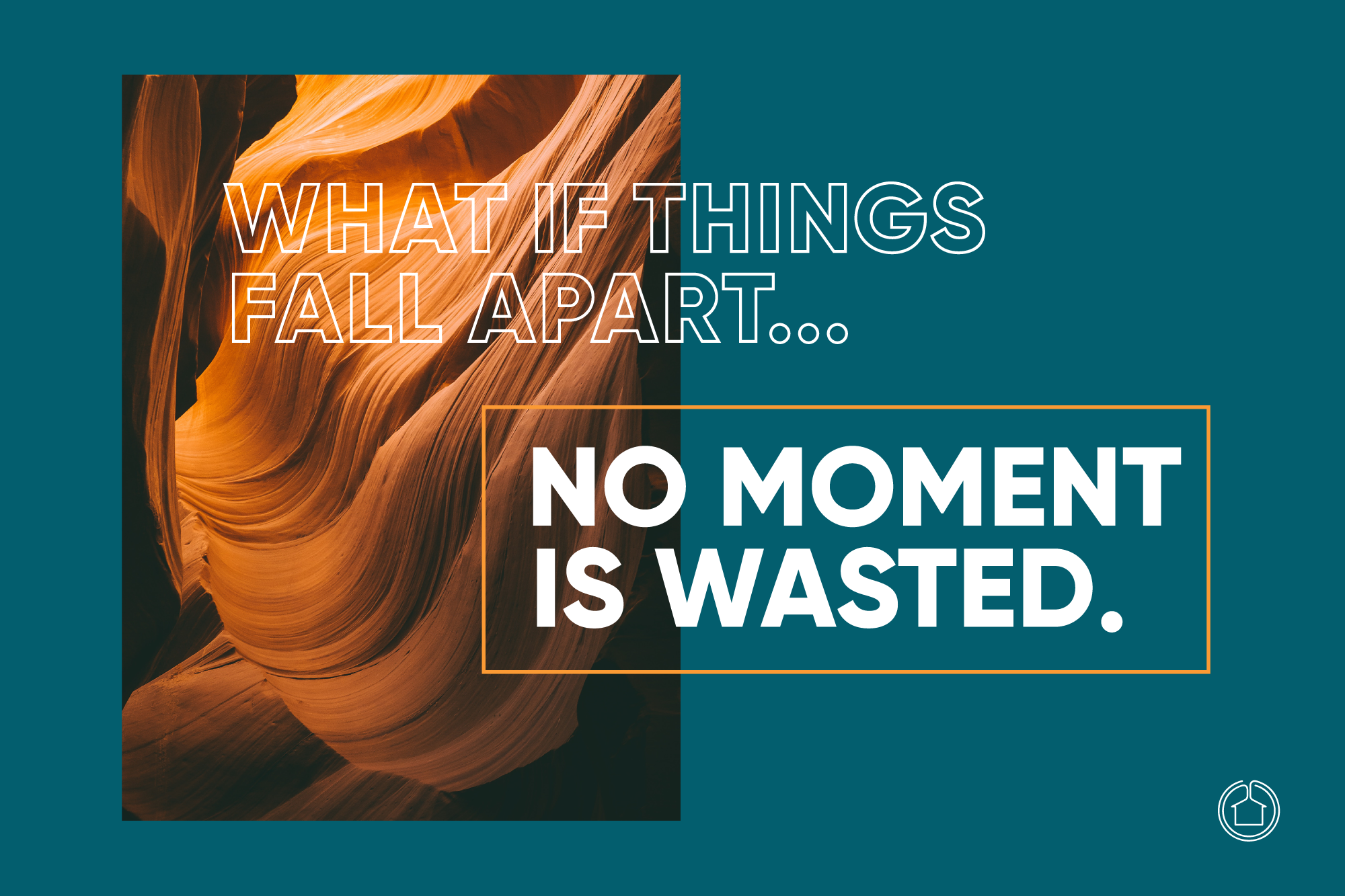
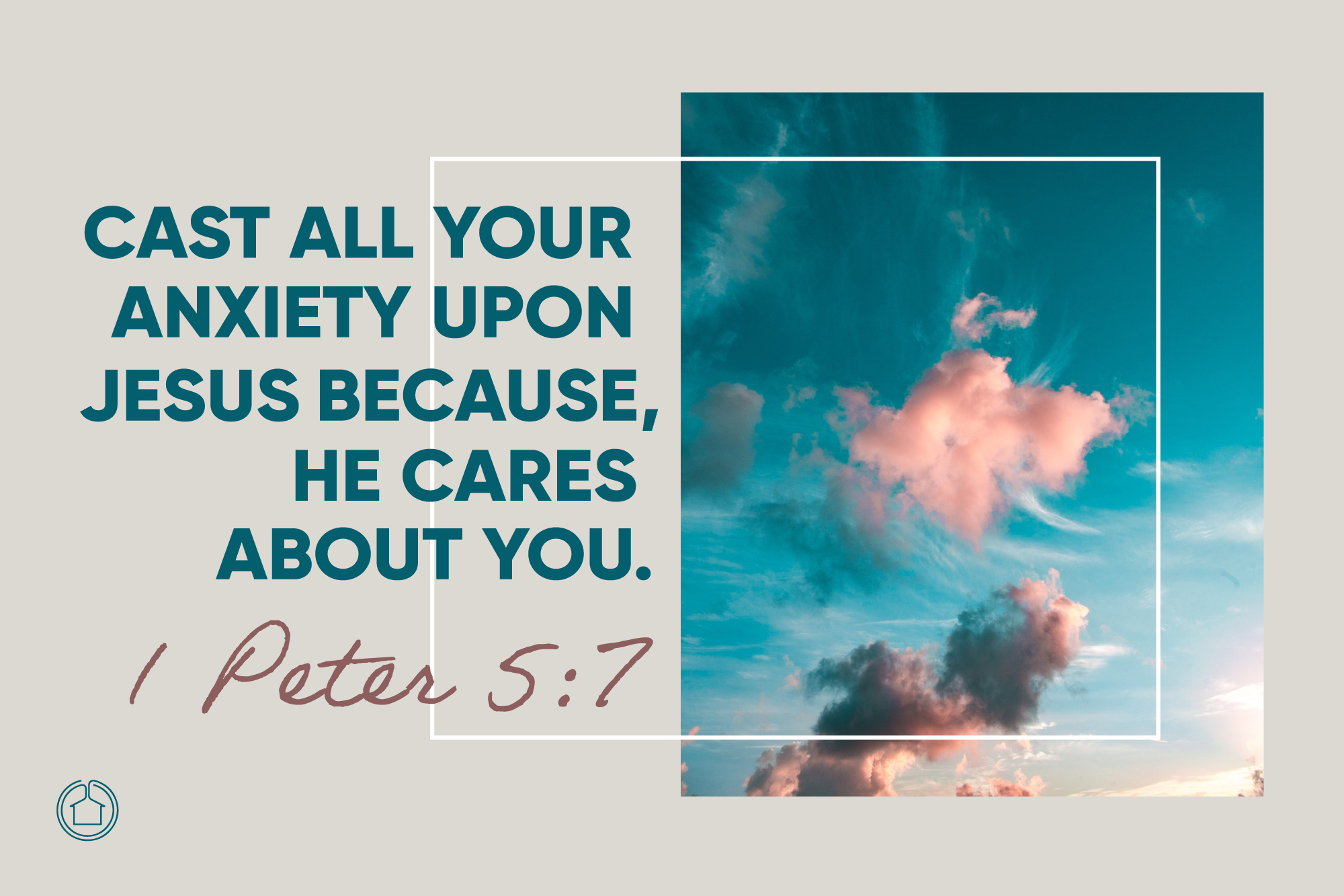
I have had the opportunity to create a few designs for Casas Church on a large scale. With some branding updates, the Church needed some Large Format Designs created for their campus and also some video and media created for a largely advertised series held.
This is a collection of a few of the multimedia desigsn I've created for them.
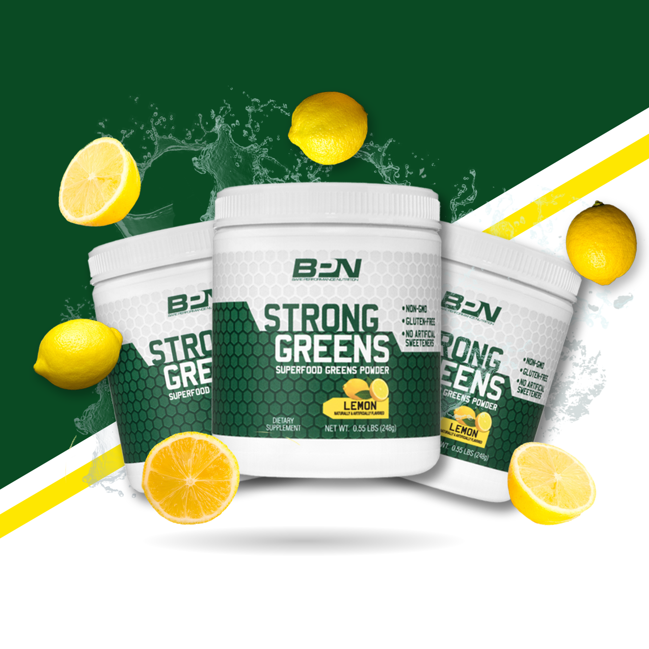
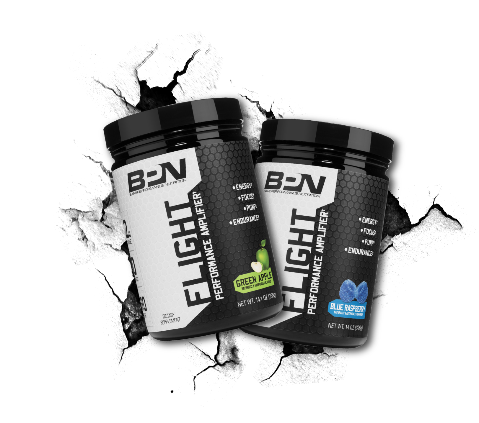
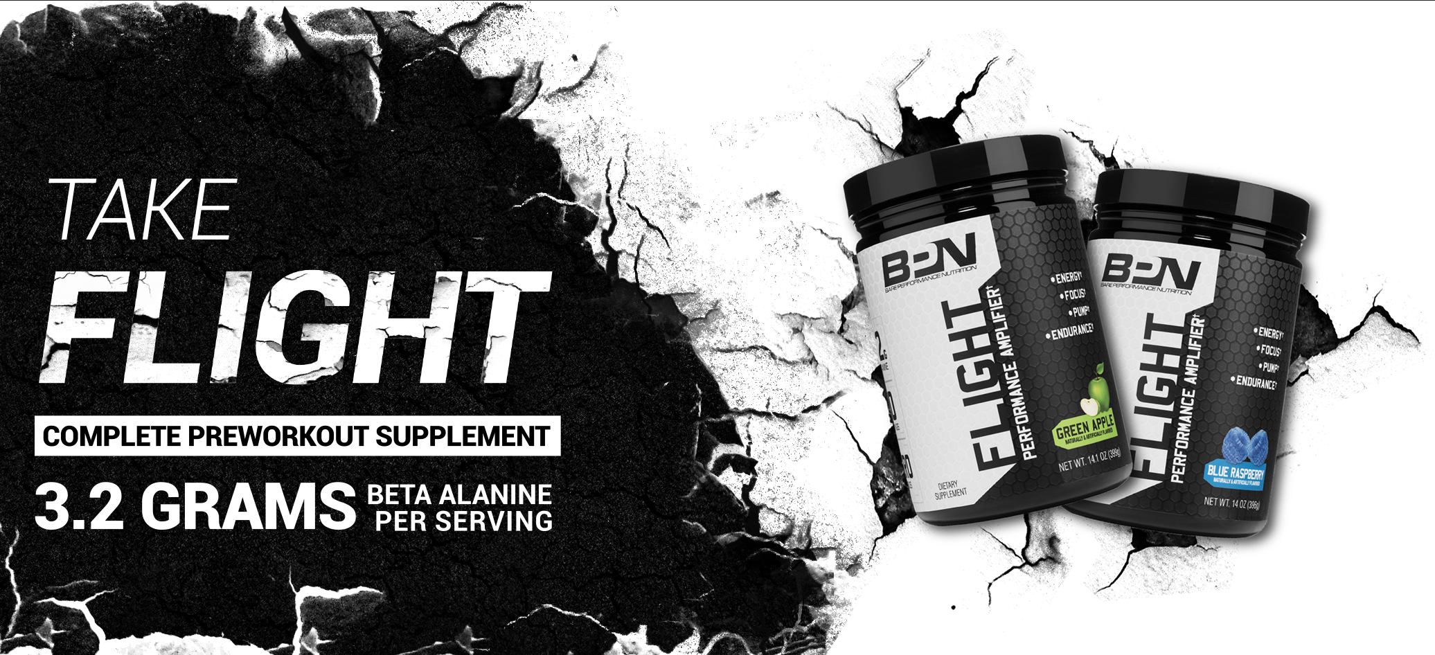
Bare Performance Nutrition was looking for a new look to their outdated banners to grab more attraction and really come off the page. Their previous banners included an image of someone using the product but nothing about the product or what the product was and really made you have to look at what kind of product it was advertising. After looking at what other nutrition companies were doing and evaluating their products, I took their banners to the next level and made their products front and center. The information is clear and concise and helps the potential customer know what the product is and brings interest to find out more.

This is a mark creation for a very talented videographer and photographer. The client wanted a lot of things to go into the design and I did my best to accommodate everything I could. It needed to have an edgy side for his fitness and musical side of his portfolio but also something a bit more light hearted for some landscape work and other ventures. He wanted a representation of a camera lens and flare in his logo which I used to wrap the main mark. The Final mark shows all the elements the client wanted.
It included a JT and a hidden W, which seconds as a mountain range; The camera lens which really attaches well to the JT Mark and even the W/Mountains with the camera flare looking like a sun/moon; as well as the edgy but light hearted overall feel. If you enjoyed the images more than the logo (which I kind of hope you didn't) you should check out some more of his stuff on Instagram @jtwiseguy.
I was contracted to created a mark for a small fitness clothing company and gym with the initials "IA", however after creation of the mark, communication unknowingly stopped and we never reconnected on the brand needs so this mark goes unused. However, I found it - and the client found it - strong and bold. It's versatile and edgy with a clean and modern approach.

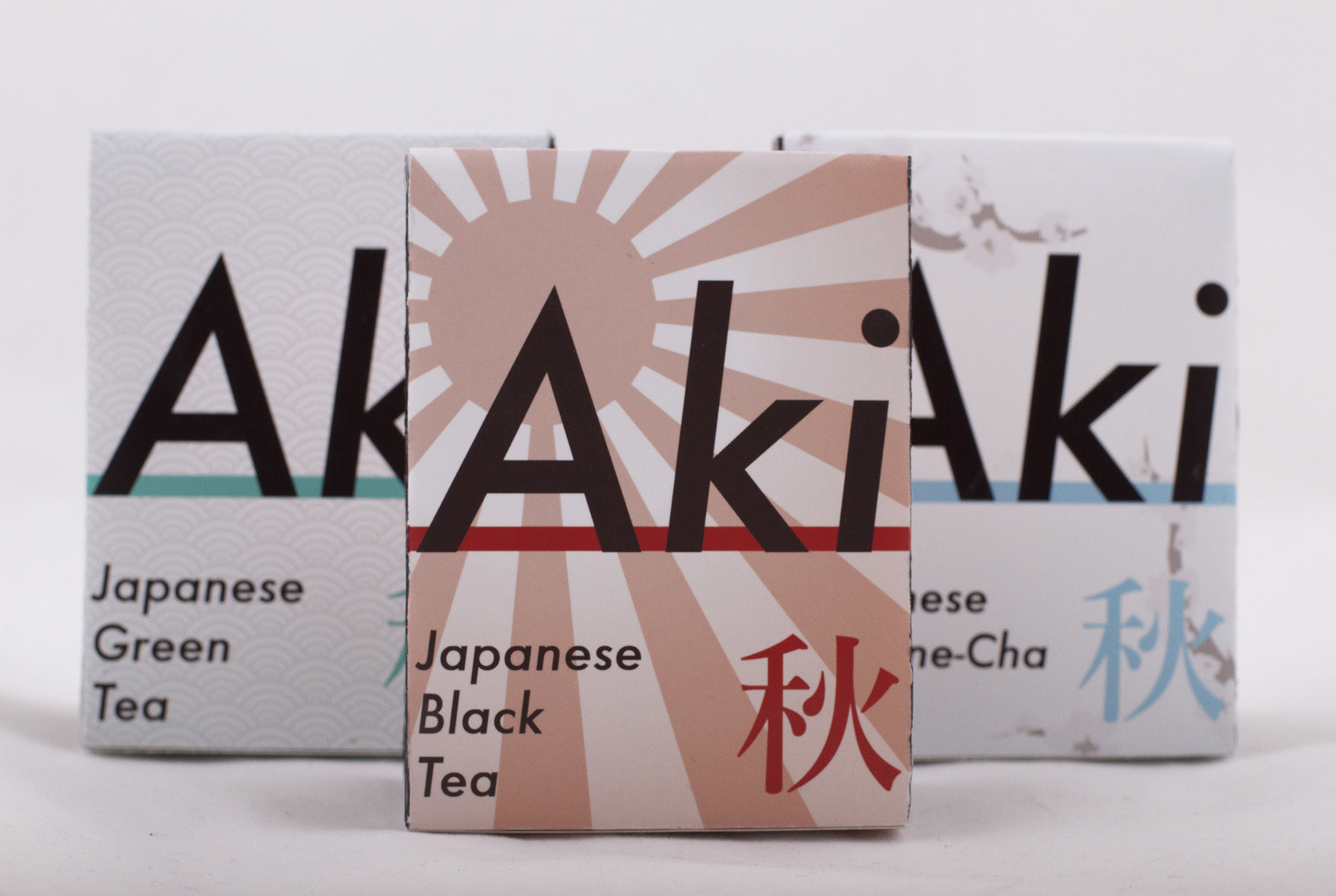
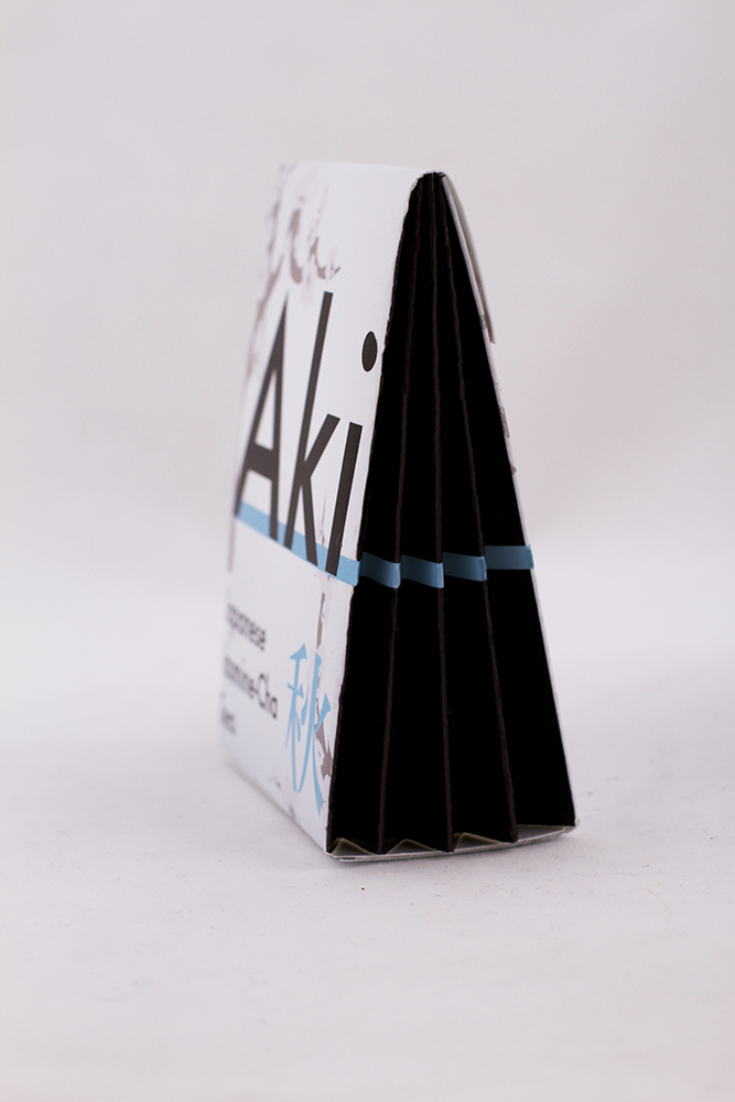
Aki, meaning Autumn, is a faux Tea company and this was a package created for the tea brand. This was a school project with the direction to create a new food or beverage package that would appeal to consumers, be functional on shelves but also be something new and stand out from generic packaging.
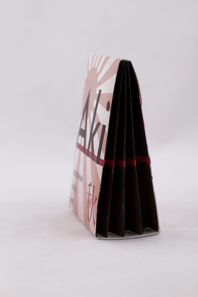
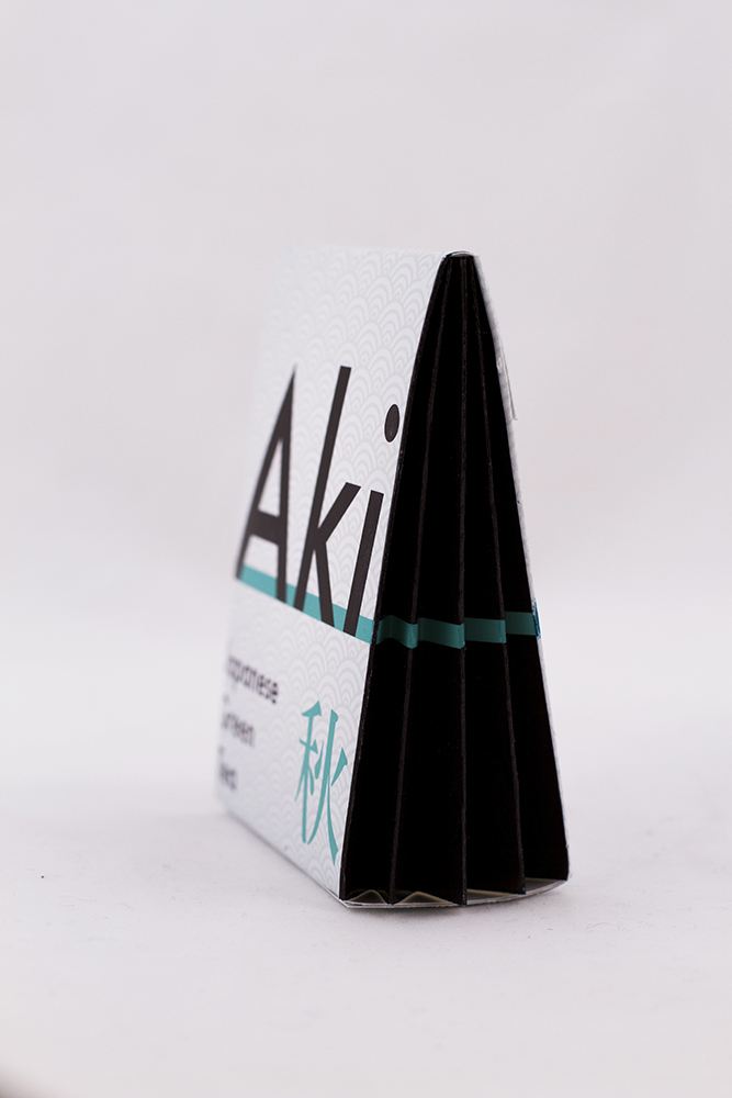
The tea package opens in an accordion style and has individual packets to grab and go. The triangle style fresh and modern style package is stackable for storing easily. It gives off a feeling of origami, tying into the Japanese style.
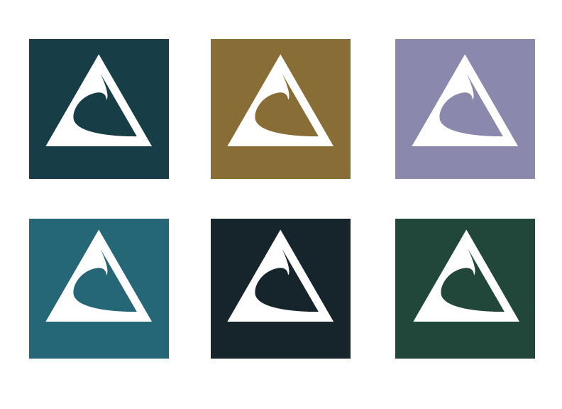
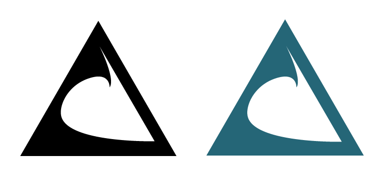
Airwave Technologies was a small business created to capture coast side drone footage of wind and wave surfers. I was contracted to created a mark, however shortly after creation, they pivoted with their small business into real estate drone footage so this mark goes unused and is for sale.

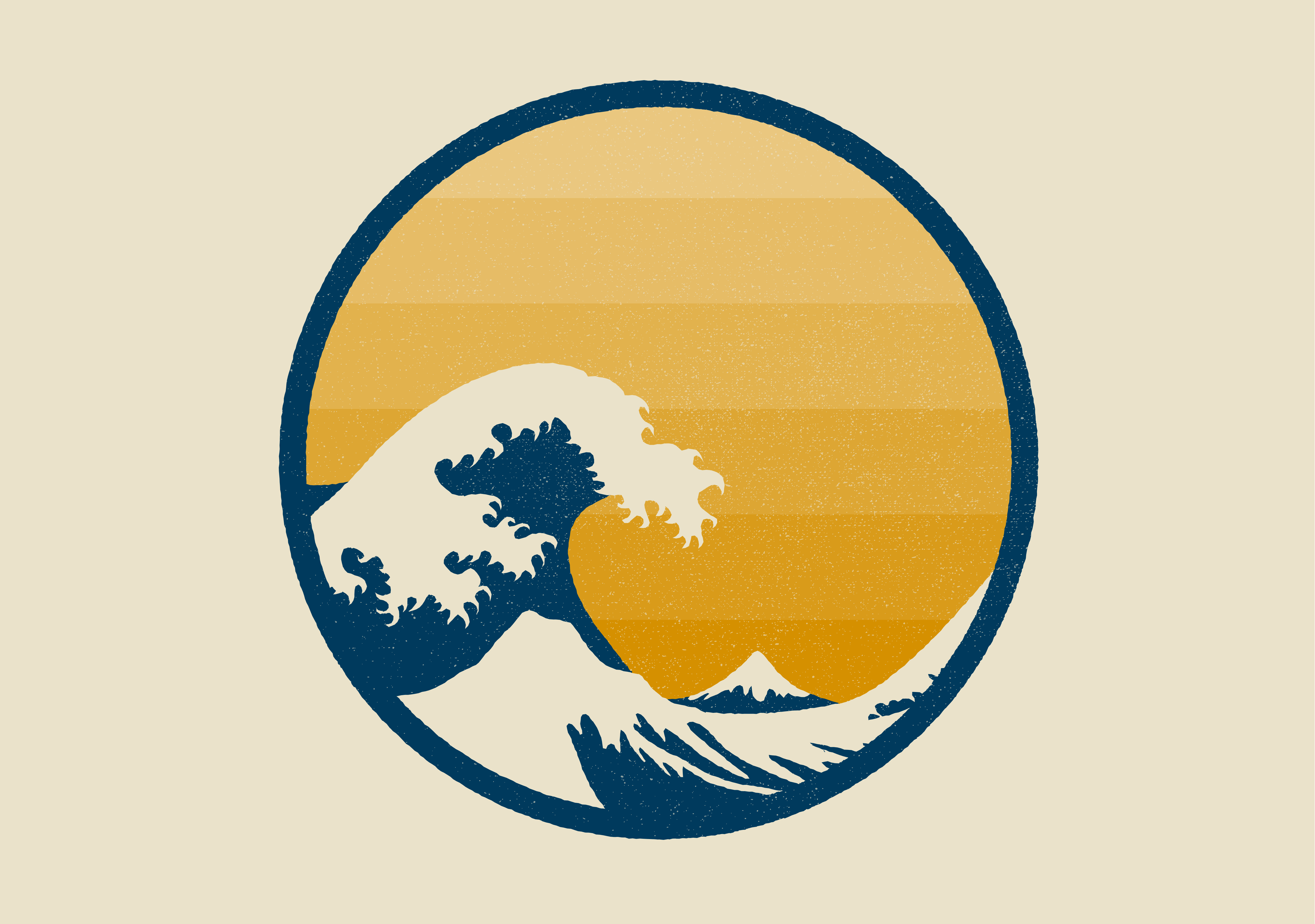
A personal love of mine is the "Great Wave of Kanagawa" by Hokusai. So much so that I've tattooed it on my body. I decided to illustrate it myself and create a version like it to be printed as a poster to display and this was the outcome.
For almost 10 years, I have been a creative in multiple design fields. Starting my career as a Graphic Designer turned Multimedia Designer, to now Web/Visual Designer and Creative Lead.
In my free time, I volunteer as a Tech Director & Creative Strategist, enjoy playing guitar, video games and watching my Las Vegas Raiders or the newest Netflix series.
I spent most of my childhood overseas in Germany, Saudi Arabia and Australia, and moved to the United States living in Arizona and Texas. I always enjoy traveling to new and exciting places (as I'm constantly in search of the best tacos).
A jack of all trades, I'm an eclectic personality with all kinds of interests and creativity. With skills in both basic front-end web development, creative project management and many design areas, I have the skill set to take any area to the next level.
Let's build something great together!
Creation of Marketing Campaign, "Your Story, Our Story"
Creation of Social Media Marketing Campaign
Introduction of Social Media Platform Marketing